The 12 Best React Native UI Libraries for Developers in 2026
Discover the best React Native UI libraries to build stunning apps faster. We compare 12 top toolkits for performance, customization, and developer experience.
 Sanket
Finding the right UI library is one of the most critical decisions in a React Native project. The best React Native UI libraries do more than just provide pre-styled buttons and inputs; they offer a solid foundation for your app's entire user experience, developer workflow, and long-term maintainability. A great library accelerates development, ensures design consistency, handles accessibility, and optimizes performance, directly impacting your ability to launch a high-quality product quickly.
However, navigating the ecosystem can be challenging. The landscape is vast and fragmented, with options ranging from comprehensive component kits to powerful, low-level styling systems designed for creating your own bespoke design language. Choosing the wrong one can lead to performance bottlenecks, customization headaches, or maintenance issues down the road. This guide is designed to cut through the noise and provide a detailed, practical analysis of the top options available today.
This resource will help you make an informed decision that aligns with your specific project goals. We will evaluate each library and platform based on real-world criteria that truly matter for indie developers, startups, and established product teams. We'll dive into key features, performance trade-offs, ease of integration with tools like Expo, theming capabilities, and the ideal use cases for each. We'll also include direct links, screenshots, and concise integration notes to help you get started immediately. Our goal is to equip you with the insights needed to select the perfect toolkit for building a production-ready application for iOS, Android, and the web.
1. React Native Directory
Before diving into specific component libraries, the essential first stop for any developer is the React Native Directory. This is not a UI library itself, but a community-maintained discovery platform managed by Expo and the React Native Community. Its primary purpose is to help you survey the entire landscape of available packages, making it an indispensable tool for finding the best React Native UI libraries that fit your project's specific technical requirements. It’s the starting point for research, not the endpoint for components.
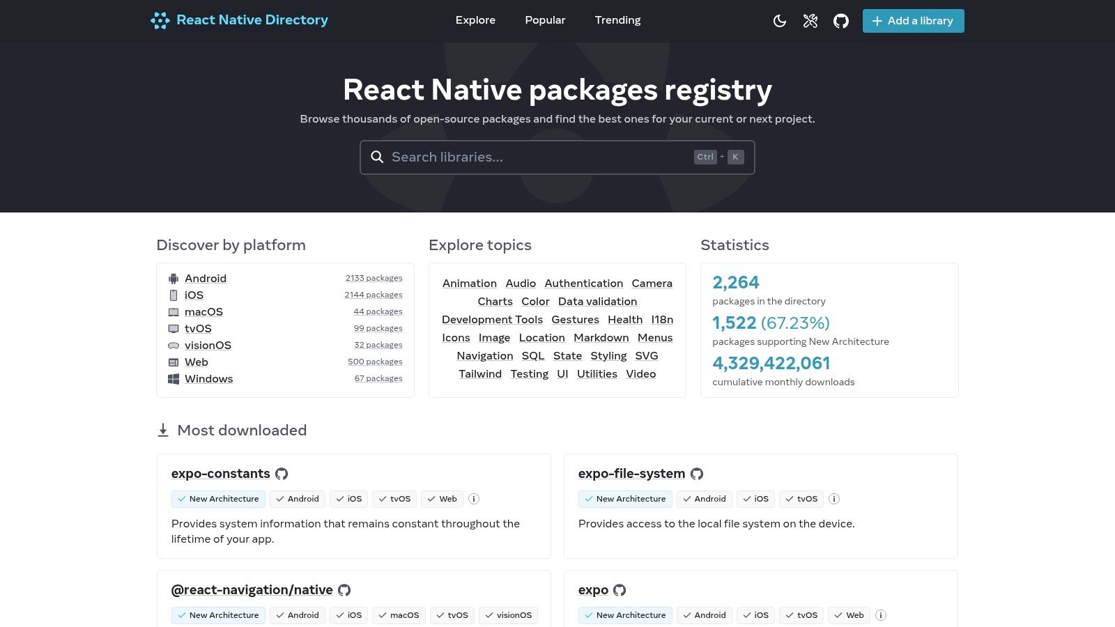 React Native Directory
The platform’s power lies in its robust filtering system. You can quickly narrow down options based on crucial compatibility factors like Expo Go support, New Architecture readiness, and platform support (iOS, Android, Web, Windows). This neutral, data-driven approach saves you hours of manual vetting. Instead of relying on a single vendor's marketing, you get a clear, unbiased view of a library's popularity, maintenance status, and version history, with direct links to its npm and GitHub pages.
Key Details & Use Cases
- Access: Completely free to use.
- Best For: Initial research and compatibility checks before committing to a UI library.
- Pro Tip: Use the "Has web support" and "Works with Expo Go" filters together to instantly find cross-platform libraries that are easy to prototype with. This is a massive time-saver for projects targeting both mobile and web from day one.
- Limitation: The directory relies on community-submitted data and package metadata, so tagging for newer features like the New Architecture can sometimes lag behind a library's actual status. Always double-check the library's official documentation.
Website: https://reactnative.directory
2. npm (npmjs.com)
If the React Native Directory is the curated map, npm is the raw, comprehensive atlas of the JavaScript ecosystem. As the default package manager for Node.js, npmjs.com is the primary registry where nearly every React Native UI library is published. It serves as the canonical source for installation commands, version histories, and dependency information, making it a non-negotiable part of a developer's workflow when evaluating the best React Native UI libraries. It provides the ground-truth data on a package's lifecycle and popularity.
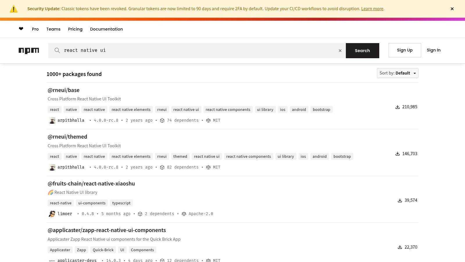 npm (npmjs.com)
While its search functionality is broader than the Directory's, its real value lies in the details. The "weekly downloads" metric offers a powerful, at-a-glance signal of a library's current adoption and momentum. You can also quickly access vital links to the source code repository, homepage, and issue tracker, allowing you to directly assess the project's health, see open issues, and review its documentation. This makes it an essential tool for verifying the information you find elsewhere and making final technical decisions.
Key Details & Use Cases
- Access: Completely free to use.
- Best For: Verifying package health, getting official install commands, and assessing ecosystem adoption via download statistics.
- Pro Tip: After finding a promising library, always click the "Repository" link on its npm page. Check the "commits" and "issues" tabs on GitHub to gauge how actively maintained the project is. A high download count with no recent commits can be a red flag.
- Limitation: npm is a registry, not a curator. Its search results include thousands of outdated, unmaintained, or hobbyist packages alongside production-ready ones. You must do your own vetting; npm won't tell you if a library is actually good.
Website: https://www.npmjs.com/search?q=react%20native%20ui
3. GitHub Topics (React Native)
For developers who prefer to assess a library's health and quality directly at the source, GitHub Topics for React Native serves as a powerful, unfiltered discovery tool. Unlike curated directories, this platform surfaces repositories based on community-applied tags, giving you a real-time view of what's popular, trending, and actively maintained. It’s an essential resource for performing due diligence before integrating a new dependency into your project.
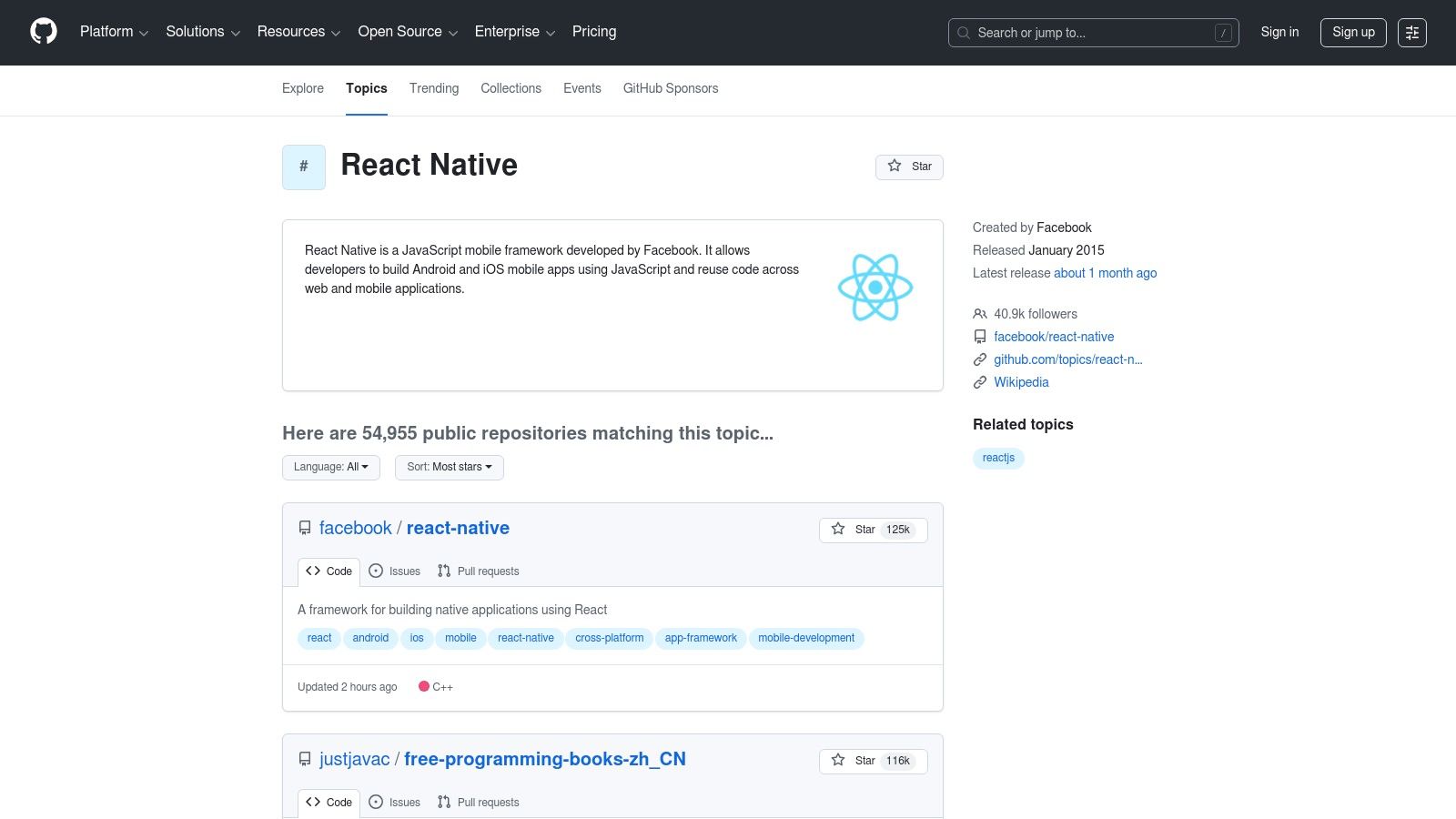 GitHub Topics (React Native)
The true value of GitHub Topics is the direct insight it offers into a project's viability. You can immediately see star history, commit frequency, open issues, and pull request activity. This transparency helps you evaluate not just the features of a UI library, but also its stability, responsiveness of its maintainers, and its future roadmap. For teams searching for the best React Native UI libraries with long-term support, analyzing this raw data is a non-negotiable step.
Key Details & Use Cases
- Access: Completely free to use.
- Best For: Evaluating the maintenance health, code quality, and community activity of a library before adoption.
- Pro Tip: Look beyond the star count. A repository with fewer stars but a high commit frequency, active issue discussions, and recent releases is often a healthier choice than a highly-starred but abandoned project.
- Limitation: It is not curated specifically for UI libraries, so you will need to sift through a mix of tools, templates, and other packages. The search requires more manual filtering compared to a dedicated directory.
Website: https://github.com/topics/react-native
4. NativeBase (now gluestack)
NativeBase has been a stalwart in the React Native ecosystem for years, known for its extensive library of over 30 fundamental components that work seamlessly across iOS, Android, and web. It leverages a utility-first props API, similar to Styled System, allowing developers to rapidly style components directly in their JSX. The project is currently transitioning to gluestack-ui, a more modern, unstyled, and "headless" core, but the classic NativeBase framework remains a powerful choice for building feature-rich applications quickly.
Its biggest strength lies in its comprehensive theming system and built-in accessibility, which is powered by React Native ARIA. This ensures that components like modals, menus, and buttons are not only customizable but also adhere to WAI-ARIA standards out of the box. The excellent documentation, complete with a "KitchenSink" demo app, makes it easy for developers to explore and implement components, making NativeBase one of the best React Native UI libraries for projects that demand both speed and accessibility.
Key Details & Use Cases
- Access: Open-source and free to use.
- Best For: Startups and teams needing to build cross-platform MVPs quickly with a consistent design system and strong accessibility features.
- Pro Tip: Fully utilize the
useColorModehook to implement light and dark themes effortlessly. The theme object is highly extensible, so you can define custom color palettes, fonts, and spacing that propagate throughout all components. - Limitation: The ongoing transition to gluestack-ui can be confusing for newcomers. While NativeBase is stable, be mindful of the ecosystem's direction and evaluate if the newer gluestack primitives might be a better long-term fit for your project.
Website: https://nativebase.io
5. React Native Paper (Callstack)
For developers looking to implement Google’s Material Design system, React Native Paper is a high-quality, production-ready choice. Maintained by the expert React Native agency Callstack, this library provides a comprehensive suite of customizable and themeable components that follow Material Design guidelines precisely. It’s one of the most popular and best React Native UI libraries for building apps with a familiar, Android-native aesthetic, while still offering excellent platform adaptation for iOS.
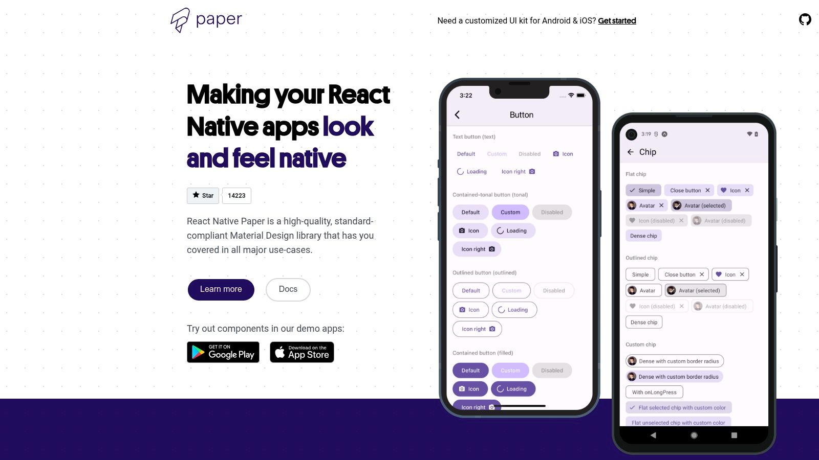 React Native Paper (Callstack)
React Native Paper excels with its robust theming system, which allows for deep customization of colors, fonts, and component styles across an entire application. This makes it simple to maintain a consistent brand identity. The library also includes first-class support for right-to-left (RTL) languages and accessibility, ensuring a wider audience can use your app. Its components are designed to feel natural on both Android and iOS, though the core design language is unmistakably Material.
Key Details & Use Cases
- Access: Open-source and completely free.
- Best For: Projects that prioritize a Material Design look and feel, especially for Android-first apps or cross-platform apps where a single design system is preferred.
- Pro Tip: Leverage the theming provider to its fullest. Define your entire color palette, typography, and component-specific styles in a central theme object. This approach makes switching between light and dark modes almost effortless and keeps your UI consistent.
- Limitation: While components adapt to iOS, they retain a strong Material Design identity. If a pixel-perfect, native iOS look (Cupertino style) is a strict requirement, you might need to perform significant customizations or consider a different library.
Website: https://reactnativepaper.com
6. React Native Elements (RNE UI)
React Native Elements is a community-driven, cross-platform UI toolkit that strikes a perfect balance between structure and customization. Rather than enforcing a strict design system, it provides a set of well-crafted, foundational components like avatars, buttons, and cards, giving developers a solid starting point. This approach makes it one of the best React Native UI libraries for projects that need a consistent look and feel without being locked into a specific design language like Material Design.
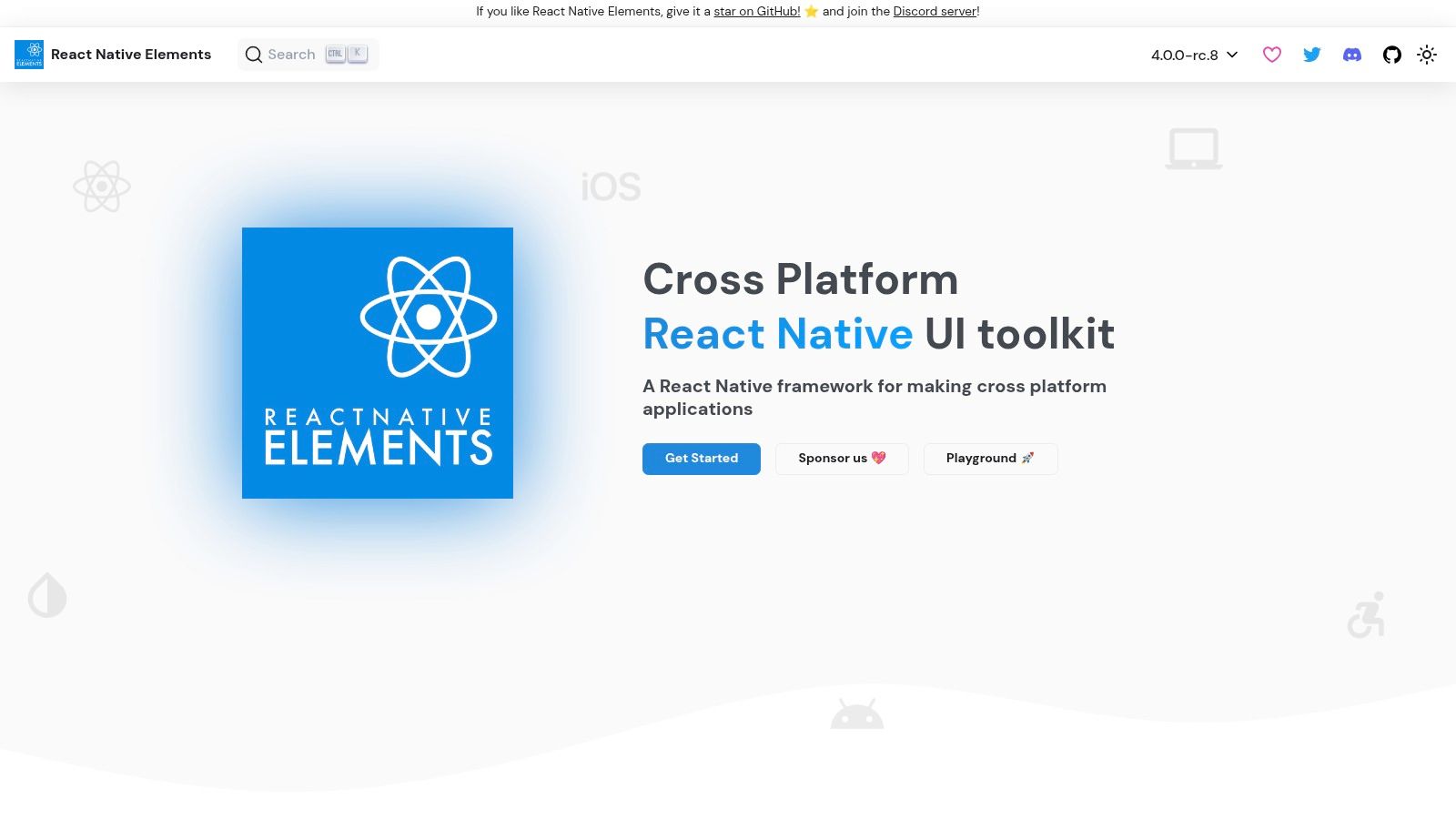 React Native Elements (RNE UI)
The library is built entirely in TypeScript, offering excellent type safety and autocompletion out of the box. Its components share a consistent styling API, which simplifies theming and prop management across the application. The active community support and straightforward API make it an ideal choice for quickly scaffolding MVPs and production-ready applications, especially for developers who value simplicity and ease of use over an exhaustive component collection. The official VS Code snippets extension further accelerates development by making component boilerplate instantly accessible.
Key Details & Use Cases
- Access: Open-source and completely free to use.
- Best For: Startups and indie developers building MVPs, or any team that needs foundational components without a rigid design system.
- Pro Tip: Combine RNE with a utility-first styling library like Tailwind CSS (using a package like
twrnc). RNE provides the component structure and logic, while Tailwind gives you granular control over the final look and feel for a highly custom, yet rapidly developed, UI. - Limitation: The component set is less comprehensive than larger libraries. You will likely need to install additional packages for more complex functionality like advanced forms, data grids, or specialized icons, as RNE focuses on core UI elements.
Website: https://reactnativeelements.com
7. UI Kitten (Akveo)
UI Kitten is a standout React Native UI library built by Akveo on top of the Eva Design System. Its core philosophy revolves around creating customizable and visually consistent interfaces with ease. The library offers a comprehensive set of general-purpose components that are themed and styled in a unified way, making it an excellent choice for projects that require a polished look right out of the box, including robust support for light and dark modes.
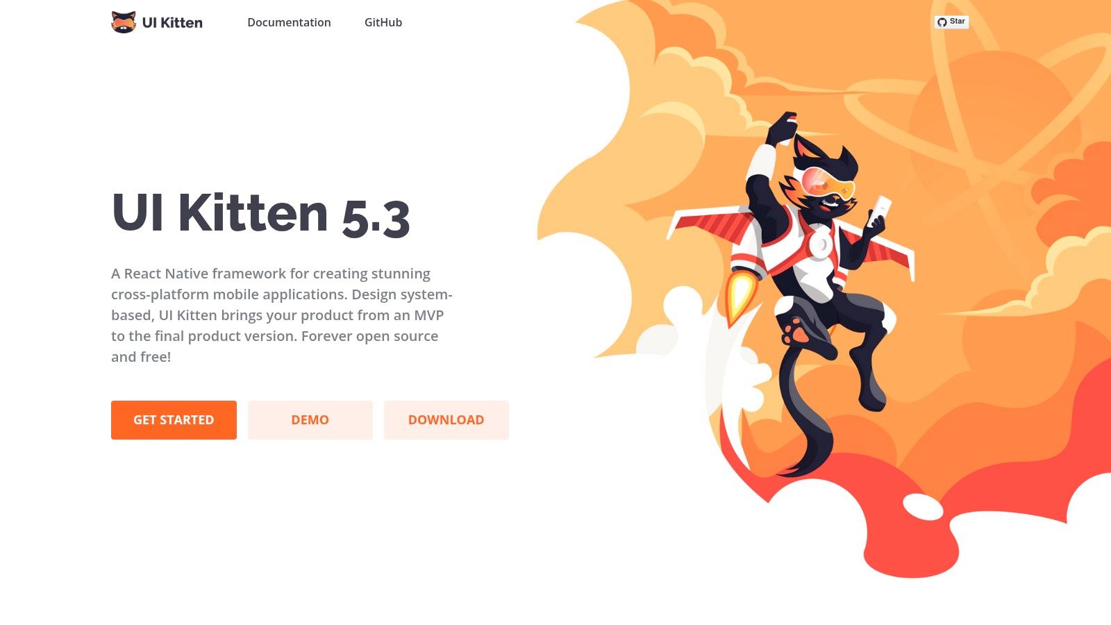 UI Kitten (Akveo)
What truly sets UI Kitten apart is its companion app, Kitten Tricks, which serves as a live showcase of the library's capabilities. This demo app, available on both iOS and Android, provides real-world screen examples like sign-in forms, dashboards, and settings pages. This allows developers to see precisely how components look and behave in a production-like environment, drastically accelerating the evaluation and prototyping phases. The theming system is powerful yet straightforward, letting you define design tokens like colors and fonts in a single location to restyle the entire application.
Key Details & Use Cases
- Access: Open-source and completely free to use.
- Best For: Developers who need a cohesive design system with powerful theming (especially for light/dark modes) and want to see practical component implementations before coding.
- Pro Tip: Use the Kitten Tricks demo app as a boilerplate. You can inspect its source code to understand how to structure layouts and combine components for complex screens, saving significant development time compared to building from scratch.
- Limitation: While the library is actively maintained, some documentation references and examples might feel slightly dated. It's always best to verify compatibility with your specific React Native version and check the GitHub repository for the latest updates.
Website: https://akveo.github.io/react-native-ui-kitten
8. Tamagui
Tamagui is a modern, performance-oriented UI toolkit that bridges the gap between React Native and the web. More than just a component library, it's a comprehensive style system and an optimizing compiler designed to create truly universal applications. Its core innovation is a compiler that flattens component trees and extracts styles into atomic CSS on the web, delivering near-native performance.
 Tamagui
This unique architecture allows developers to write platform-agnostic styles using a single, unified API with responsive and theme-aware props. By handling style optimization at build time, Tamagui significantly reduces runtime overhead, a common pain point in other cross-platform styling solutions. This makes it one of the best React Native UI libraries for projects where web performance is just as critical as native responsiveness. The included component kit, tamagui, provides a solid set of unstyled primitives and styled components to get started quickly.
Key Details & Use Cases
- Access: The core library is open-source and free. Premium themes and advanced components (Bento/Pro) are available with a paid license.
- Best For: Performance-critical applications targeting both native and web with a single codebase.
- Pro Tip: Use the provided starter templates (
npx create-tamagui) to bypass the initial setup complexity. These templates come pre-configured with the compiler, fonts, and a basic navigation structure, saving you hours of configuration. - Limitation: The compiler and unique styling paradigm introduce a learning curve. Teams accustomed to traditional
StyleSheetor CSS-in-JS libraries will need to adapt to its specific mental model and build-time tooling.
Website: https://tamagui.dev
9. Shopify Restyle
For teams that need to build their own custom design system from the ground up, Shopify Restyle provides the foundational tooling. It is not a ready-made component library like others on this list, but rather a type-safe, theme-driven system for creating your own UI primitives in TypeScript. It gives you the building blocks, like createBox and createText, to enforce design tokens and styling rules across your entire application, ensuring consistency and a superior developer experience.
 Shopify Restyle
The core strength of Restyle is its powerful integration with TypeScript. By defining your theme (colors, spacing, typography) in a central configuration file, Restyle generates type definitions that provide autocompletion and compile-time checks for all your style props. This means developers can no longer use an incorrect color or an arbitrary margin value, making it one of the best React Native UI libraries for maintaining a scalable and strict design system. It essentially makes your design language the single source of truth.
Key Details & Use Cases
- Access: Completely free and open source.
- Best For: Engineering teams building a bespoke, in-house component library or design system with strict type safety.
- Pro Tip: Combine Restyle with a tool like Storybook. This allows you to develop and visualize your themed components in isolation, creating a robust, documented, and easy-to-use component library for your entire team.
- Limitation: It has a steeper learning curve than a plug-and-play component kit. You are responsible for building all the higher-level components (buttons, cards, inputs) yourself using Restyle's primitives.
Website: https://shopify.github.io/restyle
10. Wix React Native UI Lib
Developed and battle-tested by the engineering team at Wix, the React Native UI Lib is a production-grade toolset offering a comprehensive suite of components and design system foundations. This library strikes a pragmatic balance between low-level primitives and fully-featured, ready-to-use components. Its strength lies in its integrated approach, providing not just UI elements but also a complete theming engine built on design tokens for colors, typography, and spacing.
 Wix React Native UI Lib
The library is clearly designed for teams building scalable, consistent applications. Its detailed documentation and accompanying Expo demo application make it easy to evaluate components and understand implementation patterns quickly. Because it’s backed by a major tech company, it benefits from real-world product experience, resulting in practical and reliable components that solve common UI challenges. This makes it a strong candidate for startups and product teams looking for one of the best React Native UI libraries that can grow with their needs.
Key Details & Use Cases
- Access: Open-source and completely free to use.
- Best For: Teams that need a holistic UI system with theming, design tokens, and a wide range of production-ready components out of the box.
- Pro Tip: Leverage their
Spacings,Colors, andTypographymodules from the start. Building your custom theme on top of their token system ensures every component you use will adapt consistently, saving significant styling and maintenance time later on. - Limitation: The library's theming and state management helpers can feel opinionated. If you already have a deeply integrated theming solution like Styled Components or Tamagui, integrating this library might require more configuration to avoid conflicts.
Website: https://wix.github.io/react-native-ui-lib
11. CodeCanyon (Envato Market) – React Native UI Kits/Templates
For teams prioritizing speed to market over granular component control, CodeCanyon offers a different approach. Rather than a library of individual components, it's a massive marketplace for purchasing complete, pre-built React Native UI kits and full application templates. This is an ideal solution when you need to launch a minimum viable product (MVP) or prototype quickly, as these kits bundle together screens, navigation flows, and assets for common app types like eCommerce, finance, or food delivery.
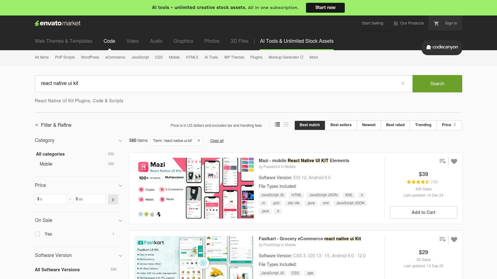 CodeCanyon (Envato Market) – React Native UI Kits/Templates
Unlike open-source component libraries, this is a commercial marketplace where you buy a license for a finished product. The primary advantage is getting dozens of professionally designed screens that are already wired together, drastically reducing initial development time. You can browse live previews and check user reviews to assess the quality before purchasing. However, the trade-off is that code quality, maintenance, and support can vary significantly between different authors, and you may need to refactor parts of the codebase to fit your specific architecture or coding standards.
Key Details & Use Cases
- Access: Paid, with per-item pricing and specific license terms.
- Best For: Startups, agencies, and developers needing to build and ship an MVP or a full-featured app on a tight deadline.
- Pro Tip: Pay close attention to the "Last Update" date and the author's comment section. An actively maintained template with responsive support is far more valuable than a slightly cheaper but abandoned one. Always check the live demo on your target devices.
- Limitation: Post-purchase support and updates depend entirely on the individual seller. Integrating these templates into an existing project can be more complex than adding a modular component library.
Website: https://codecanyon.net/search/react%20native%20ui%20kit
12. Creative Tim – React Native Templates
For developers and teams looking to accelerate app development with pre-built, production-quality screens, Creative Tim offers a curated marketplace of React Native UI kits and templates. Rather than providing a component library, it delivers complete design systems like Material Kit, Argon, and Now UI. These kits are often available in both free and premium versions, providing a low-risk entry point for evaluation. Many templates come with Expo support out-of-the-box, making them excellent for rapid prototyping and MVP launches.
The primary advantage is speed. Instead of building every screen from scratch, you get a cohesive set of components and example pages (like profiles, settings, and onboarding flows) that share a consistent design language. This makes it one of the best React Native UI library resources for entrepreneurs or agencies needing to deliver a polished product under tight deadlines. Detailed documentation, live previews, and clear changelogs help you choose the right template for your project's aesthetic and functional needs.
Key Details & Use Cases
- Access: Offers both free and paid (PRO) templates, typically with a one-time purchase fee.
- Best For: Startups, freelancers, and agencies who need to launch a visually complete app quickly without a dedicated designer.
- Pro Tip: Always check the "Changelog" and "Version" tabs on a product page. This will tell you how recently the template was updated and ensure it supports the React Native versions you plan to use.
- Limitation: The templates have a strong, opinionated design. Customizing them to fit a unique brand identity can sometimes require more effort than starting with a more barebones component library.
Website: https://www.creative-tim.com/templates/react-native
Top 12 React Native UI Libraries Comparison
| Item | Core features | UX / Quality | Value / Price | 👥 Target audience | ✨ Unique selling points |
|---|---|---|---|---|---|
| React Native Directory | Aggregated library listings, filters (Expo, New Arch), public JSON API | ★★★★ 🏆 Neutral curation & compatibility signals | 💰 Free | 👥 Developers researching libs | ✨ Powerful filters + metadata links to npm/GitHub |
| npm (npmjs.com) | Registry: versions, install commands, download stats, deps | ★★★★ Canonical package source | 💰 Free | 👥 All developers installing & tracking packages | ✨ Semver history, download trends, changelogs |
| GitHub Topics (React Native) | Repo discovery: stars, commits, issues, READMEs | ★★★★ Direct insight into maintenance & activity | 💰 Free | 👥 Engineers vetting code quality & roadmap | ✨ Issues/PRs reveal stability and roadmap |
| NativeBase (gluestack) | 30–40 components, theming, React Native ARIA accessibility | ★★★★ Mature ecosystem, good docs | 💰 Free | 👥 Rapid-prototyping teams needing accessible UI | ✨ Accessible primitives + KitchenSink demo app |
| React Native Paper (Callstack) | Material Design components, theming, RTL support | ★★★★ Material-first, solid documentation | 💰 Free | 👥 Android-first apps / Material designers | ✨ Full Material theming & Expo examples |
| React Native Elements (RNE) | 30+ TypeScript components, theming, VS Code snippets | ★★★ Active community, simple API | 💰 Free | 👥 MVP builders & quick scaffolds | ✨ VS Code snippets + Expo demos for fast dev |
| UI Kitten (Akveo) | Eva Design System, theming, light/dark modes, demo app | ★★★★ Polished demo app for evaluation | 💰 Free | 👥 Prototypers who want real-world screens | ✨ Kitten Tricks showcase app accelerates prototyping |
| Tamagui | Compiler + unified style system, responsive props, web/native optimizations | ★★★★ Strong performance; steeper mental model | 💰 💰 Freemium (some paid Pro components) | 👥 Teams focused on cross-platform performance | ✨ Compiler flattens styles & extracts CSS for web |
| Shopify Restyle | Type-safe design tokens, createBox/createText primitives | ★★★★ Excellent DX & type guarantees | 💰 Free | 👥 Teams building internal design systems in TS | ✨ Type-enforced variants & token-driven APIs |
| Wix React Native UI Lib | Design tokens, wide component coverage, Expo demo | ★★★★ Production-tested, pragmatic APIs | 💰 Free | 👥 Product teams / enterprises | ✨ Backed by Wix with migration notes & demos |
| CodeCanyon (Envato) | Marketplace of UI kits & full app templates, demos & reviews | ★★★ Variable quality; fast selection | 💰 Paid per item | 👥 Teams wanting fastest time-to-market (paid) | ✨ Large selection + live previews & licensing |
| Creative Tim | Curated free & PRO templates, live demos, docs | ★★★★ Polished design languages | 💰 Freemium | 👥 Designers/devs wanting polished templates | ✨ Cohesive PRO themes, solid documentation and demos |
Final Thoughts: Accelerate Your Build with the Right Foundation
Navigating the vibrant ecosystem of React Native UI libraries can feel overwhelming, yet it’s a critical first step in defining your application's future. As we've explored, the landscape is incredibly diverse, offering everything from atomic, unopinionated styling primitives to comprehensive, feature-rich component suites. Your journey to finding the best React Native UI libraries for your project is less about finding a single "perfect" solution and more about aligning a library’s philosophy with your team's specific goals, technical expertise, and design vision.
The choice you make at this stage has a cascading effect. Opting for a low-level, highly customizable tool like Shopify Restyle or the innovative Tamagui grants you ultimate control and type-safe design system creation. This path is ideal for teams with strong design direction and the engineering resources to build a truly bespoke user experience from the ground up. Conversely, if your priority is speed and adhering to established design paradigms, libraries like React Native Paper (for Material Design) and UI Kitten (for its powerful theming engine) offer a significant head start with production-ready components.
Key Takeaways and Decision-Making Framework
To distill our findings into actionable advice, consider these crucial factors before committing to a UI foundation:
- Speed vs. Control: Are you building a quick MVP where a pre-styled kit like NativeBase (gluestack) accelerates development, or are you crafting a unique brand identity that demands the granular control of a styling-focused library? Your timeline and design specificity are the primary drivers here.
- Platform Parity: How critical is a consistent look and feel across iOS, Android, and the web? Libraries like Tamagui and gluestack are built with this "write-once, run-anywhere" philosophy at their core, while others may require more platform-specific tweaks.
- Ecosystem and Maintenance: A library's strength is also in its community and the team behind it. Check the GitHub activity, the frequency of updates, and the responsiveness to issues. An active, well-maintained library like those from Callstack or Wix is a safer long-term bet than one with dwindling support.
- Learning Curve and Customization: Consider your team's familiarity with React Native. A library like React Native Elements offers a simple, intuitive API that's easy for beginners to grasp. In contrast, mastering the full potential of a more complex system like Tamagui might require a more significant initial time investment.
Your Next Steps: From Selection to Implementation
Your task now is to move from analysis to action. Start by shortlisting two or three libraries from this list that most closely match your project's profile. Create small proof-of-concept applications for each one. Try to build a single, moderately complex screen-perhaps a user profile or a product detail page. This hands-on experiment will reveal more than documentation ever could about the developer experience, performance characteristics, and the true ease of customization.
Remember that integrating even the best React Native UI libraries is just one piece of the puzzle. You still need to configure navigation, manage application state, handle user authentication, and connect to your backend services. This foundational boilerplate, while necessary, can consume valuable time that could be spent building the unique features that define your app. Selecting the right library is the first step; building the complete application architecture is the next. Whichever path you choose, a thoughtful investment in your UI foundation will yield a more stable, scalable, and maintainable application for years to come.
Ready to skip the tedious setup and start building your app's core features immediately? AppLighter provides a production-ready React Native starter kit built on Expo, pre-configured with a powerful UI foundation, navigation, authentication, and an AI-powered toolchain to accelerate your entire development workflow. Explore how you can launch faster and build smarter at AppLighter.
Related Articles
Top 12 React Native UI Libraries for Expo Projects in 2026
Discover the top 12 react native ui libraries for Expo developers. A deep dive into performance, theming, and real-world use cases to speed up your app.
The Top 12 React Native UI Library Options for Developers in 2026
Discover the best react native ui library for your project. Our 2026 guide compares 12 top libraries with pros, cons, and integration tips.

What Is Cross Platform App Development A Guide for Modern Teams
Uncover what is cross platform app development and how it works. This guide compares top frameworks and shows you how to build apps faster and more efficiently.