10 Ideas for App Design That Feel Production-Ready
Explore 10 ideas for app design, from navigation and onboarding to performance and data architecture, with practical Expo and React Native guidance.
 Rishav
Pretty screens don't rescue a weak product. They often hide it for a sprint or two, then users hit friction, get lost, or stop opening the app. In a market where people spent 5.3 trillion hours in apps in 2025, up 3.8% year over year, or about 3.6 hours per day per mobile user according to mobile app usage data for 2025, design choices around navigation, onboarding, and feedback aren't decoration. They're product behavior.
The most useful ideas for app design start with how the app should work under pressure. That means deciding how people move between key tasks, how quickly they understand value, what happens when data is loading, how auth interrupts flow, and whether the interface still feels stable on a slow connection. Visual style matters, but it should sit on top of those decisions, not replace them.
That's the lens for this roundup. These ten patterns connect interface choices to accessibility, performance, architecture, and cross-platform delivery. Some are obvious, like tabs and cards. Some are usually treated as implementation details, like state boundaries and notification deep links. They belong in the same conversation.
If you're building with Expo and React Native, this is also where a starter foundation can save weeks. AppLighter is relevant here because it ships with authentication, navigation, state management, and AI-assisted tooling already wired into the project structure, which makes it easier to turn mobile app design best practices into production-ready flows instead of isolated mockups.
Table of Contents
- 1. Bottom Tab Navigation Pattern
- 2. Onboarding Flow and Progressive Disclosure
- 3. Card-Based UI Layout
- 4. Gesture-Based Navigation
- 5. Micro-Interactions and Haptic Feedback
- 6. Dark Mode Design System
- 7. Authentication and Social Login Integration
- 8. Real-Time Data and Push Notifications
- 9. Performance Optimization and Lazy Loading
- 10. State Management and Data Flow Architecture
- 10 App Design Ideas Compared
- Turn the Strongest Pattern Into a Coherent Product
1. Bottom Tab Navigation Pattern
Bottom tabs are still one of the safest bets in mobile product design because they reduce memory load. People shouldn't have to remember where core sections live. They should see them, tap them, and recover instantly if they take a wrong turn.
This pattern works best when the app has three to five primary destinations. Instagram, Spotify, and TikTok all use tabs because their core behaviors repeat. Browse, search, create, review, return. If your app has more than five equally important areas, the problem usually isn't the tab bar. It's that the information architecture isn't settled yet.
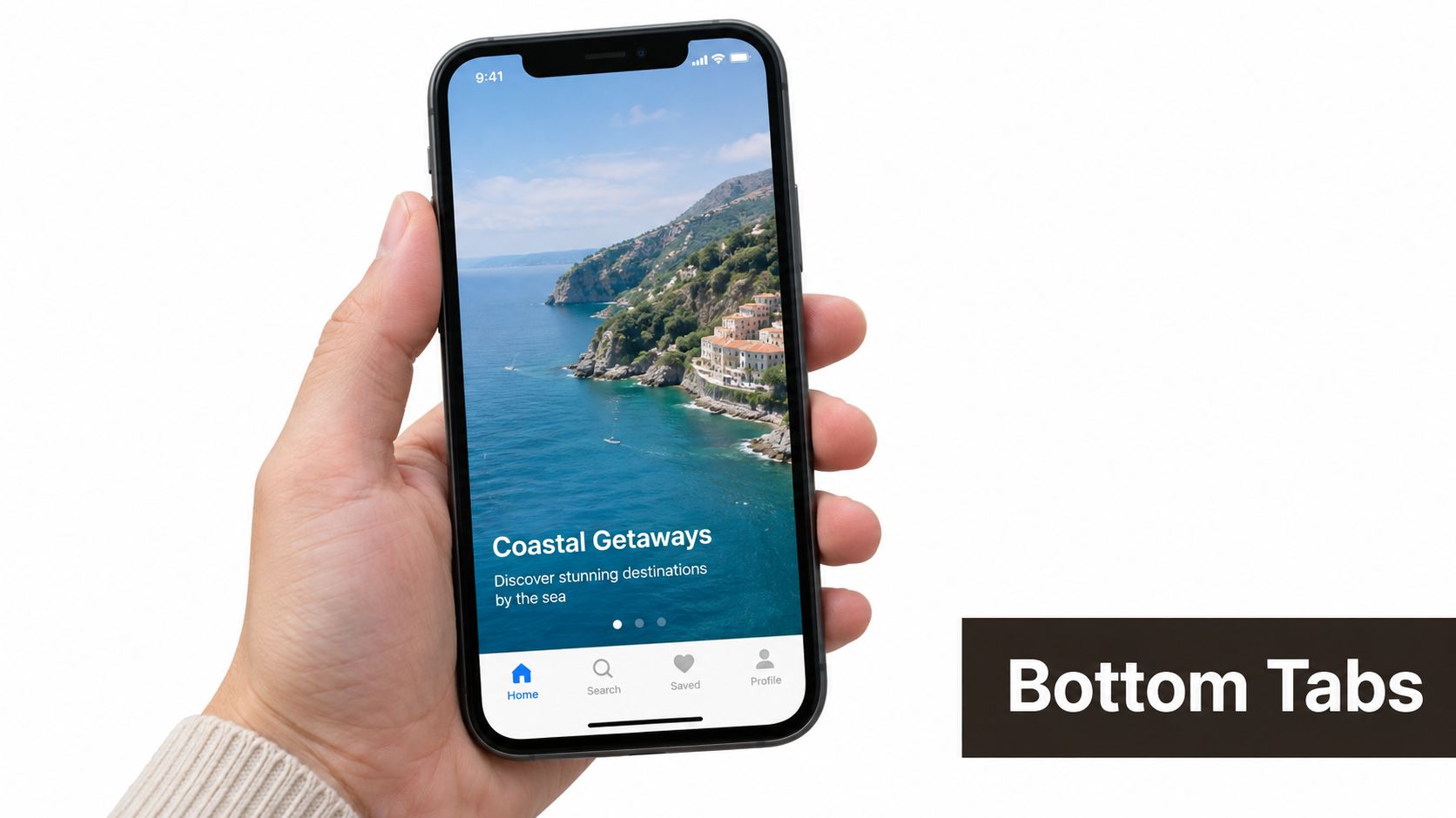 A hand holding a smartphone displaying a travel mobile application interface with bottom navigation tabs.
Make the tab bar carry product meaning
In Expo and React Native, React Navigation's tab navigator gives you the base quickly, but the work is deciding what deserves persistent visibility. Home, Search, Inbox, and Profile are obvious. “More” is often a warning sign that the tab bar is absorbing unresolved scope.
A few implementation rules tend to hold up:
- Use labels with icons: Icons alone look cleaner in mocks, but labels reduce guesswork and help new users.
- Protect the center tab: If you use a create action in the middle, keep its behavior singular. Don't make it open a crowded menu.
- Respect safe areas: Devices with notches and gesture areas expose weak spacing decisions fast.
Practical rule: If a destination matters every day, make it visible every day.
Android scale matters here too. In 2025, Google Play accounted for 104.6 billion app downloads, or 73.5% of worldwide downloads, while iOS accounted for 36.6 billion, or 26.5%, according to global app download distribution data. That's one reason tab patterns should be tested on a wider range of Android device sizes, not just a single iPhone simulator.
For teams refining nested stacks, modal routes, and tab history, this React Native navigation guide is the kind of reference worth keeping close.
2. Onboarding Flow and Progressive Disclosure
Good onboarding removes decisions before it adds instruction. The first session should answer a product question fast: Can this app help me do the thing I came here to do? If that answer takes five intro slides, the design system and the architecture are already working against the product.
Duolingo earns attention by starting with action. Slack earns it by asking for the context it needs, then teaching inside the workspace. Different products, same system decision: delay explanation until the user has a reason to care, and delay data collection until the app can justify the ask.
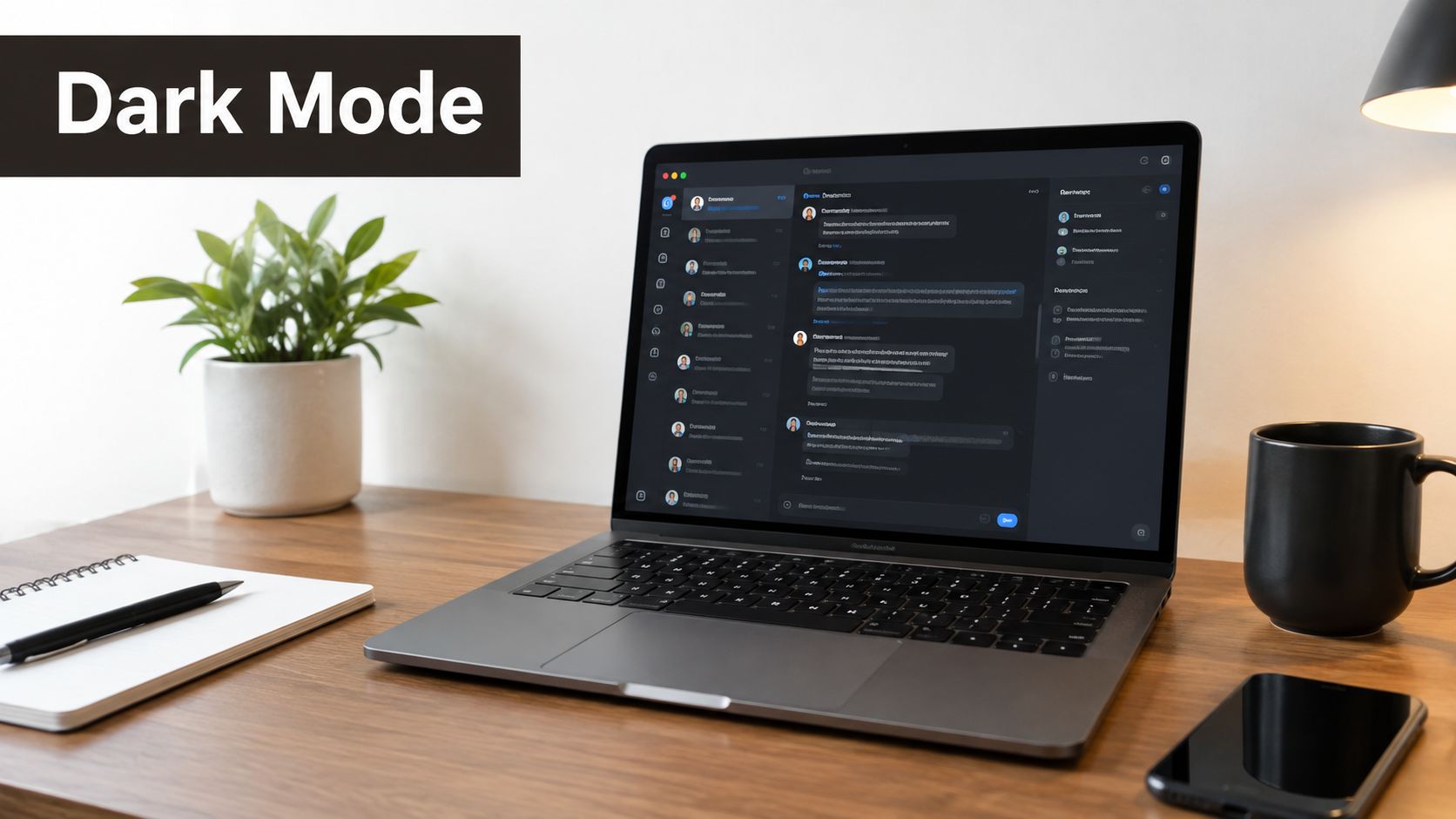 A modern desk featuring a laptop displaying a dark mode chat interface, beside a plant and notebook.
Build onboarding around state, not screens
Teams often treat onboarding as a one-time carousel. In practice, it is a state machine. New user, partially set up user, returning user, invited teammate, logged-out user, permission-denied user. Each state needs a different path, and that choice affects routing, storage, analytics, and accessibility.
A better default is a short entry point followed by contextual teaching inside the product:
- Ask for the minimum to reach first value.
- Seed empty states with realistic sample data so the interface does not feel broken.
- Trigger tips from user actions and route context, not from a fixed script.
This changes implementation details in Expo and React Native. Persist onboarding status locally for speed, then reconcile with server state after launch if the account model requires it. Keep coach marks dismissible. Respect screen reader order and reduced motion settings. If a tip blocks the interface, treat it like product debt and justify it.
Permission prompts are a common failure point. Request notifications, contacts, camera, or location at the moment the feature needs them. iOS and Android both punish premature prompts with lower acceptance and harder recovery. The UI pattern matters, but the sequence matters more.
I usually use feature flags or remote config for first-run experiments instead of hardcoding one onboarding path. That lets teams test whether sample content, deferred sign-up, or a later permissions ask improves activation without shipping a new binary. For product teams studying real examples of staged onboarding, Otter onboarding examples and experiments are a useful reference.
3. Card-Based UI Layout
Cards work when the product needs fast scanning, uneven content, and a clear next action. They fail when teams use them as a container for everything they could not prioritize.
That distinction affects more than visual style. A card changes how users read a feed, how touch targets are grouped, how lists virtualize, and how state is modeled across iOS and Android. Pinterest, Airbnb, Medium, and the Play Store all use cards, but each one limits what a card is allowed to do.
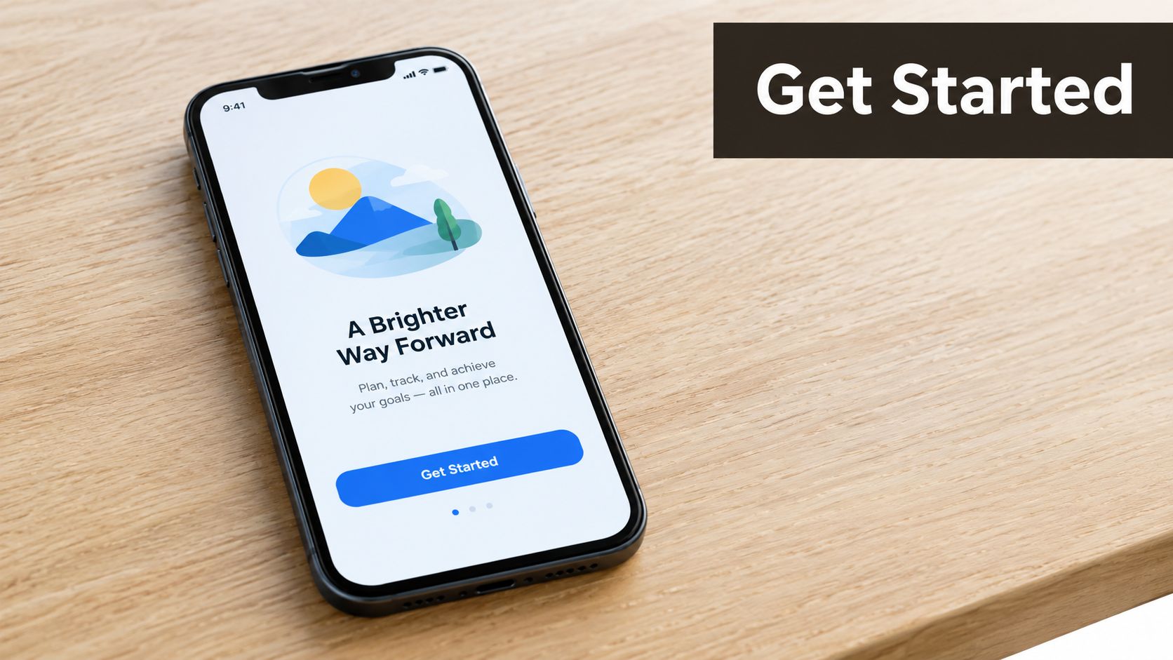 A modern smartphone displaying a clean onboarding app screen with a mountain illustration on a wooden table.
A useful rule is simple. One card should support one primary decision.
For a rental app, that might be save or open details. For a reading app, continue or dismiss. Once a card carries multiple buttons, stacked badges, overflow menus, progress states, and long metadata, the user has to inspect instead of scan. Feed speed drops. So does implementation clarity, because a single reusable component starts accumulating exceptions.
I usually treat cards as system components with hard limits, not flexible marketing blocks. Set a fixed image ratio. Clamp titles. Define one primary tap target. Decide which status indicators are always visible and which move into the detail screen. Those constraints improve comprehension, and they also keep React Native components predictable under localization, larger text sizes, and variable network data.
Expo and React Native teams feel the trade-off quickly in list performance. Rich cards invite shadows, remote images, gradients, and nested touchables. Each choice has a cost. FlatList with stable keys is the baseline, but card design still determines whether the list feels light or heavy. Skeleton placeholders help because they preserve structure while data arrives. Aggressive image resizing, memoized item rows, and limited rerenders matter more here than decorative polish.
Baymard's mobile app UX research points out how often mobile apps fall into a mediocre range of usability, based on Baymard's mobile app UX research. Card feeds often reveal that problem first. Weak hierarchy, small tap areas, and inconsistent spacing make browsing feel slower than the content deserves.
Accessibility is the stress test. A card layout that only works at default font size is unfinished. Test with larger text, screen readers, reduced motion, and longer translated labels. Check reading order. Check focus order. Check whether "Save" inside a fully tappable card creates duplicate or confusing actions. The visual pattern is familiar. The product system behind it still needs discipline.
4. Gesture-Based Navigation
Gestures feel modern when they remove friction. They feel hostile when they hide core actions. That trade-off matters more than the gesture itself.
Swipe-back on iOS is useful because people expect it. Pinch-to-zoom in Google Photos feels natural because the content invites it. Tinder-style swiping works because the entire product loop is built around quick directional decisions. Problems start when teams use gestures to save space while removing visible controls users still need.
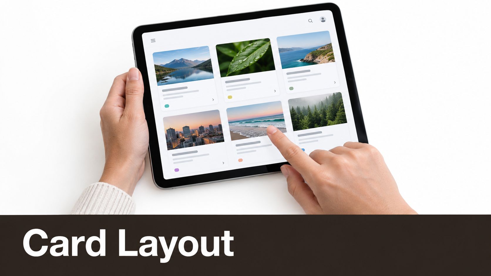 A person holds a tablet displaying a clean card layout design with various nature and city images.
Keep critical actions visible
A hidden gesture can be a shortcut. It shouldn't be the only path for an important task. Archive by swipe is fine if a menu or button still exists. Dismissing a modal with a downward drag is fine if there's still a close affordance.
For React Native teams, React Native Gesture Handler is usually the right base for smooth gesture work in production apps. Pair it with visible state changes, haptics where appropriate, and careful conflict testing around scroll views, nested carousels, and edge swipes.
Gestures should reward fluency, not demand it.
Accessibility is where many gesture-heavy designs fall apart. VoiceOver and TalkBack users need explicit controls, focus order, and labels that don't depend on motion. If a gesture changes state, expose the same state change through a button or menu action too.
One more practical test helps a lot. Hand the screen to someone who hasn't seen the feature and ask them to complete the task without instruction. If they fail, the gesture isn't intuitive enough yet.
5. Micro-Interactions and Haptic Feedback
Polished apps do not feel polished because they move a lot. They feel reliable because every small response reduces doubt.
A pressed button that reacts at once, a short confirmation after save, a light haptic on selection. These details shape trust at the system level. If feedback is late, vague, or inconsistent, users start tapping twice, second-guessing destructive actions, or assuming the app stalled even when the backend is fine.
Start with the tactile side of the experience here:
The practical rule is simple. Reserve motion and haptics for moments where the interface changes meaning. Selection, success, failure, reorder, expand, refresh, handoff to a new state. Apple Notes and Slack get this right because their feedback reinforces intent instead of decorating it.
Teams building in Expo or React Native should make one technical decision early. Which interactions must run on the UI thread, and which can tolerate a round trip through JS? That choice affects whether a tap feels immediate or mushy under load. For performance-sensitive motion, use the Animated API or Reanimated. For haptics, test on physical devices because motor strength, timing, and OS handling vary enough that simulator checks miss the experience.
Three production patterns tend to hold up better than flashy effects:
- Acknowledge input before the network returns. Pressed, loading, and disabled states prevent repeat taps and duplicate requests.
- Keep repeated interactions brief. A favorite toggle can animate in a fraction of a second. A full-screen transition shown dozens of times per session should stay restrained.
- Respect system preferences. Reduced motion and muted haptics are product requirements, not edge cases.
One more trade-off matters. Each micro-interaction adds implementation surface area. Animation state can drift from actual data state. Haptics can fire on optimistic success, then the request fails. The fix is architectural, not visual. Bind feedback to explicit state transitions in your component or store, not to tap handlers alone.
For a deeper breakdown of where tactile feedback helps and where it becomes noise, this guide on haptic feedback in mobile apps maps the trade-offs clearly.
6. Dark Mode Design System
Dark mode succeeds or fails in the details users touch for hours. Reading a long thread at night, scanning a chart, spotting the active tab, catching an error state in a form. If those moments blur together, the theme is broken even if the palette looks polished in a mockup.
The practical unit of work is not the screen. It is the token plus the component state.
In React Native, define semantic tokens first: background, surface, surface-raised, text-primary, text-secondary, border-subtle, accent, success, warning, and destructive. Then map light and dark values onto them and keep raw color values out of feature code where possible. That one decision affects more than maintainability. It reduces visual drift, simplifies QA, and makes platform-specific adjustments easier when iOS and Android render contrast differently.
A dark theme also changes how hierarchy is created. Pure black often collapses layers into one plane, especially on OLED screens. Slightly lifted surfaces, stronger spacing, and restrained border use usually do more work than adding brighter colors. Brand accents need the same discipline. A color that feels balanced on white can dominate a dark interface and pull attention away from content.
Three failure points show up late if the system is only reviewed on marketing screens:
- State coverage: Pressed, focused, selected, disabled, error, and success states need their own contrast checks.
- Dense content: Articles, chat histories, settings screens, and long forms expose weak text contrast fast.
- Mixed media: Charts, thumbnails, maps, and empty states often carry hard-coded colors that break the theme.
Accessibility and implementation are tied together here. If a disabled button, secondary label, and inactive icon all collapse into the same gray, users lose meaning and developers start adding one-off overrides. That usually turns into theme debt. The fix is architectural. Keep semantic intent in the design tokens and pass theme values through shared primitives such as Text, Button, Card, and input wrappers instead of styling each screen independently.
System switching deserves real testing too. React Native's useColorScheme() helps, but live theme changes often reveal components that cached colors, images that assume a light background, or status bar settings that lag behind the current theme. Expo and React Native teams should test full app transitions, not just cold starts in dark mode.
Typography matters more here than many teams expect. In dark UI, weight, line height, and spacing carry more of the readability load because contrast is doing less forgiving work. design system typography best practices are especially useful for apps with long-form text, comments, or dashboard screens with mixed content.
7. Authentication and Social Login Integration
Authentication sets the product's first trust boundary. Users are deciding whether the app looks legitimate, whether the request is proportionate, and whether they can recover if something goes wrong. A stylish sign-in screen does not fix a weak flow.
Recent app trends keep pushing teams toward passwordless entry, social sign-in, and lower-friction account creation, and this mobile app trends overview captures that direction well. The design mistake is treating more login options as automatic progress. Choice helps only when the paths are easy to compare and the consequences are clear.
The practical job of the screen is to reduce hesitation. Explain why an account is needed, which providers are supported, whether verification is required, and where the user will return after leaving the app for email, SMS, or an identity provider.
A few implementation decisions shape the experience more than the visual treatment:
- Set one primary path: If Apple sign-in is the fastest route on iOS, give it clear priority instead of presenting every method as equally important.
- Keep session state stable: Users should sign in again because policy requires it, not because tokens were stored inconsistently or refresh logic failed in the background.
- Finish recovery inside the product: Password resets, magic links, and email verification should deep link back to the exact screen or task the user started from.
For Expo and React Native teams, these choices touch the whole product system. Social login changes native configuration, token storage, redirect handling, analytics events, and support workflows. Biometrics add convenience, but only after the session model, fallback path, and device-change recovery are reliable. With pre-wired authentication setup, teams can spend less time on plumbing and more time on consent copy, provider ordering, and recovery UX.
8. Real-Time Data and Push Notifications
Live data and push alerts get treated like product upgrades. They are infrastructure choices with UX consequences. Each update stream changes battery use, backend load, cache strategy, accessibility behavior, and how often users decide your app is worth opening again.
The useful question is narrow: which information must update now to support the core job?
Slack needs message sync that stays accurate across devices. DoorDash needs order state changes that match reality within seconds. Figma needs collaboration events that resolve conflicts cleanly. A habit tracker usually needs reliable local state first, then selective reminders, not constant network chatter.
Design freshness with intent
Separate continuous awareness from interruption. Continuous awareness covers refreshed lists, presence indicators, unread counts, and status changes inside the interface. Interruption covers push notifications, banners, sounds, and lock-screen alerts.
That product split should drive the technical split. If an event matters only after the user opens the app, fetch or subscribe in-app and keep the UI stable while new data arrives. If an event changes a real-world task, such as a courier arriving or a payment failing, notify outside the app and deep link to the exact recovery step.
The best notification is often the one you chose not to send.
Good notification design is mostly restraint. Teams get better results by defining categories, setting frequency rules, and giving users control at the moment those controls make sense. Order updates can default to on. Promotional alerts should not. Quiet hours, grouped notifications, and per-topic preferences do more for retention than adding another badge to the tab bar.
For Expo and React Native teams, product design meets architecture fast. Expo push services can simplify delivery, but the harder problems sit above transport: token lifecycle, permission timing, deep-link routing, idempotent event handling, and state reconciliation when a user opens a notification on a stale screen. Real-time views also need honest UI states. Show "sending," "reconnecting," or "updated just now" when that is true. Users notice the gap between visual certainty and actual system state, especially on weak networks or older devices.
Accessibility matters here too. Frequent live updates can overwhelm screen reader users if every change announces itself. Batch non-urgent updates, use clear labels for changing status text, and reserve assertive announcements for events that require action.
Well-designed real-time behavior feels calm, not busy. The interface stays current, notifications stay relevant, and the system does not pretend every event deserves immediate attention.
9. Performance Optimization and Lazy Loading
Fast apps earn trust before users notice the visual design. Slow ones make every other design decision look worse.
Performance work should start at the screen model, not at the end of QA. If a home screen mixes live counts, autoplay video, remote images, and three independent queries, the design has already committed the team to heavier rendering, more network churn, and more edge cases on older devices. Treat lazy loading as a product rule. Load what supports the current decision. Defer what can wait.
The useful question is not "how do we make this screen faster?" It is "what must be ready in the first second, and what can arrive later without breaking confidence?"
A few patterns hold up well in production:
- Render only what users can act on now. Use FlatList or SectionList for long collections, keep item components light, and avoid nesting large scrollable regions that fight virtualization.
- Stage content in layers. Text and structure can appear first. Secondary charts, related modules, and high-resolution media can load after interaction starts.
- Cache for return visits. Recent data, image thumbnails, and drafts should survive app restarts when the product benefits from continuity.
- Split expensive routes from the hot path. Admin screens, rarely used settings flows, and heavy visualization libraries should not delay the first useful paint of core journeys.
Each choice affects accessibility and architecture too. Skeletons need stable layout and meaningful semantics, or screen reader users get noise instead of progress. Infinite feeds need focus management, or keyboard and assistive tech users lose their place. Aggressive prefetching can make transitions feel smooth, but it also increases data use and memory pressure on low-end Android devices.
Expo and React Native teams usually get the biggest win by reducing work, not by masking it. Memoize where it prevents real rerenders. Resize images before they hit the client. Keep navigation stacks shallow where possible. If a tab remounts and refetches everything on every visit, that is usually a state ownership problem or a route configuration problem, not a design detail.
Recent product trend coverage also points to offline behavior and on-device processing as practical expectations, not premium extras, as noted in this roundup of mobile app development trends. That matters because lazy loading without an offline plan can leave key screens half-usable. Good product systems define what is cached, what expires, what can be edited offline, and how the UI explains delayed sync.
One implementation test catches a lot: open the app on a mid-range device, on weak network, after a cold start, then switch tabs quickly and return to the first screen. If content jumps, spinners reset, or controls block while non-critical modules load, the problem is not only performance. The screen is asking the system to prove too much too early.
10. State Management and Data Flow Architecture
State design decides whether an app feels reliable.
Users do not see your store setup, cache policy, or event flow. They see a filter reset after a tab switch, an unread badge that lags behind reality, or a draft that vanishes after a token refresh. Those are product-system failures, not isolated UI mistakes. The visual layer gets blamed first, but the root cause usually sits in ownership and data lifetime.
Start by classifying state by behavior, not by screen. A text input value, a signed-in session, a paginated feed, and a feature flag do not deserve the same storage strategy because they change on different schedules and fail in different ways. Expo and React Native teams that make this split early ship calmer interfaces and spend less time tracing side effects across navigation, API, and rendering code.
A useful model looks like this:
- Keep transient UI state close to the component. Modal visibility, input focus, temporary selections.
- Put shared client state in a small store. Auth, app-wide preferences, cross-screen draft metadata.
- Treat server state as a cache with rules. Fetching, invalidation, retries, background refresh, optimistic writes.
That separation affects implementation details quickly. If a product list filter lives in route params, deep linking gets easier but complex filter editing becomes awkward. If the same filter lives only in a global store, restoring state across links and notifications gets harder. If drafts autosave to local storage, users get resilience on weak networks, but sync conflicts need clear merge rules once the device reconnects.
Library choice matters less than boundaries. Context works for stable, low-frequency shared values. Zustand stays readable for small to mid-size apps that need selective subscriptions without Redux ceremony. Redux still fits teams that need strict event history, middleware, and predictable debugging across a larger codebase. Server data usually benefits from a dedicated cache layer instead of hand-rolled request state.
One warning sign is easy to spot. If opening one screen mutates three others, your state graph is too implicit.
The build pipeline also shapes these decisions. Analysts at InfoQ, summarizing the 2024 React Native ecosystem survey, reported broad adoption of Expo EAS Build in production workflows in their survey coverage. That trend does not pick your state library for you. It does mean architecture choices now live closer to CI, release channels, environment config, and reproducible builds than many design discussions account for.
A few rules keep the system easier to operate:
- Keep stores narrow. Large global state objects hide ownership and increase accidental rerenders.
- Subscribe with selectors. Components should react to the smallest useful slice of state.
- Model idle, loading, success, and error explicitly. Null is not a state machine.
- Define conflict behavior for offline edits before you add optimistic UI.
- Clear state on logout with intention. Some caches should reset. Some onboarding flags should not.
For teams comparing Context, Zustand, Redux, or a split between UI state and server caching, this guide to state management in React Native is a useful reference for comparing trade-offs before the app grows around the wrong abstraction.
10 App Design Ideas Compared
| Component | 🔄 Implementation Complexity | ⚡ Resource Requirements | 📊 Expected Outcomes | 🧭 Ideal Use Cases | ⭐ Key Advantages | 💡 Quick Tips |
|---|---|---|---|---|---|---|
| Bottom Tab Navigation Pattern | Low, standard nav libs and predictable UX | Low, icons, nav library (e.g., React Navigation), safe-area handling | Clear primary navigation; faster task access | Apps with 3–5 core sections; MVPs; multi-platform launches | Thumb-friendly, platform-consistent, persistent access | Use BottomTabNavigator, limit to ≤5 tabs, respect safe areas |
| Onboarding Flow & Progressive Disclosure | Medium–High, UX design, adaptive logic, analytics | Medium, design assets, copy, analytics, conditional flows | Improved retention and feature adoption; fewer support requests | Consumer apps and startups prioritizing retention | Reduces decision paralysis; personalizes new-user experience | Keep intro ≤3–5 screens, allow skip, track drop-offs, A/B test |
| Card-Based UI Layout | Low–Medium, layout + list performance considerations | Low–Medium, design system, list components (FlatList/Masonry) | Better scannability and touch targets; responsive feeds | Content apps, e-commerce, social feeds, galleries | Strong visual hierarchy; familiar and touch-friendly | Use FlatList/MasonryList, meet 44×44pt tap target, optimize images |
| Gesture-Based Navigation | High, gesture recognition, conflicts, edge cases | Medium–High, gesture libraries, haptics, extensive device testing | Reduced UI chrome; faster flows for experienced users | Mobile-first, design-forward consumer apps | Space-saving, modern interactions, faster expert navigation | Provide visual hints, haptic feedback, fallback buttons, test accessibility |
| Micro-Interactions & Haptic Feedback | Medium, timing, performance tuning, cross-device behavior | Medium, animation libs (Lottie/Animated), device testing, designers | Increased perceived responsiveness, delight, and polish | Premium consumer apps, demos, engagement-focused products | Immediate feedback; emotional engagement; perceived speed | Keep animations <300ms, use Lottie/Animated, allow disabling haptics |
| Dark Mode Design System | Medium–High, dual color systems and asset variants | Medium, color tokens, QA across themes, image adjustments | Reduced eye strain, OLED battery savings, modern aesthetic | Production apps targeting iOS/Android; privacy/battery-aware users | Accessibility benefits; expected modern feature; battery gains | Use tokenized themes, test WCAG contrast, use useColorScheme() |
| Authentication & Social Login Integration | Medium, multiple flows, token management, security | Medium–High, backend/auth providers, OAuth setup, security reviews | Lower signup friction, higher conversion and retention | MVPs; consumer apps needing cross-platform user management | Reduces friction; offloads security to trusted providers; biometrics | Leverage Supabase/Firebase Auth, enable biometrics, handle token refresh |
| Real-Time Data & Push Notifications | High, realtime infra and reliable push delivery | High, WebSocket/Realtime backend, FCM/APNs, monitoring | Higher DAU/engagement; timely updates and re-engagement | Collaborative tools, marketplaces, community apps | Immediate updates; re-engagement; live collaboration | Send only important notifications, allow granular controls, use FCM |
| Performance Optimization & Lazy Loading | Medium–High, architecture planning and profiling | Medium, profiling tools, caching, image optimization effort | Faster loads, reduced bandwidth, smoother UX and lower costs | Apps with large datasets; bandwidth-constrained markets | Faster initial load, lower hosting costs, smoother scrolling | Use FlatList, dynamic imports, cache responses, profile with DevTools |
| State Management & Data Flow Architecture | High, setup, patterns, and team alignment | Medium–High, libraries (Redux/Zustand), DevTools, testing | Easier debugging, maintainability, supports complex features | Scaling apps, team projects, production-grade apps | Eliminates prop drilling; deterministic state; easier testing | Start with Context for small apps, normalize data, separate server/UI state |
Turn the Strongest Pattern Into a Coherent Product
The best ideas for app design don't arrive as isolated features. They become useful when they reinforce one another. A clear tab bar supports faster onboarding because users can predict where things live. Thoughtful card layout makes lazy loading feel intentional instead of broken. Good state boundaries make real-time updates feel stable instead of jumpy. Authentication, notifications, and dark mode all affect trust, not just convenience.
A practical sequence helps. Start with the core task. What is the one thing the user opens the app to do? Once that's clear, choose the navigation pattern and content structure that make that task easiest to repeat. Only then should you shape onboarding, empty states, gestures, and feedback patterns around that flow.
After that, pressure-test the invisible decisions. Does authentication interrupt momentum or support it? Does live data improve the product or just increase complexity? Can the interface recover gracefully when connectivity is poor? Does your state model reflect how the product behaves across screens, sessions, and platforms?
That system view matters because mobile scale is unforgiving. App downloads reached 142.2 billion in 2025, including 96.9 billion downloads for apps and 45.3 billion for games, based on 2025 mobile app download statistics. There's no shortage of alternatives on a user's home screen. Most products don't lose attention because the colors were wrong. They lose it because the experience felt heavy, confusing, or forgettable after the first few sessions.
My advice is to prototype one focused flow before expanding. Pick a real journey such as account creation to first success, or browse to save, or message to reply. Build that path end to end with realistic data, loading behavior, failure states, and navigation. Once that flow feels credible, the right visual language becomes easier to define because it's serving an actual product shape.
If you're building in Expo and React Native, AppLighter is one practical option for starting from a working foundation instead of assembling every system from scratch. Its pre-configured authentication, navigation, state management, and AI-assisted development tooling fit the exact categories that tend to slow teams down when they try to turn design ideas into shippable software.
AppLighter gives Expo and React Native teams a starter kit with authentication, navigation, state management, and AI-assisted tooling already wired into the project. If you're turning ideas for app design into real product flows, it helps you spend more time refining behavior and less time stitching together foundations. Visit AppLighter to see how it fits your next build.