React Native Login Page Design: Build Seamless Auth UI
Master React Native login page design with step-by-step guidance on UX, accessibility, validation, and modern auth patterns for production apps.
 Damini
You've probably seen this happen: a user opens your app, taps the sign-in field, wrestles with the keyboard, mistypes a password, and then gets an error that doesn't explain what to do next. The screen may look polished, but the experience still feels hostile. In production, a React Native login page has to do more than display a logo, two inputs, and a button. It must remain usable with large text, assistive technology, unreliable networks, expired sessions, provider failures, and authentication methods that don't involve passwords at all.
That's the difference between a visual mockup and a dependable authentication surface. Good React Native login page design reduces effort without hiding important choices, gives users a clear recovery path, and keeps behavior consistent across iOS, Android, and web.
Table of Contents
- Rethinking the Mobile Login Experience
- Building Accessible and Responsive Layouts
- Integrating Modern Passwordless Authentication
- Implementing Robust Form Validation and State
- Adding Polished Animations and Transitions
- Choosing the Right Architecture for Scale
Rethinking the Mobile Login Experience
A conventional email-and-password form looks simple because it pushes complexity onto the person signing in. Users have to remember credentials, switch keyboards, interpret validation messages, and repeat the process when a password manager or network request fails. On mobile, that burden is especially noticeable. A University of Munich study cited by UXcel's overview of mobile form usability found that entering a password character on mobile takes almost twice as long as entering one on desktop.
That observation changes the design brief. The question isn't “How can we make the form look cleaner?” It's “How can we help the user authenticate with the least unnecessary effort while preserving control and trust?” A short form, correct autofill metadata, a visible password reveal control, and a biometric or passkey option usually do more for the experience than decorative gradients or elaborate illustrations.
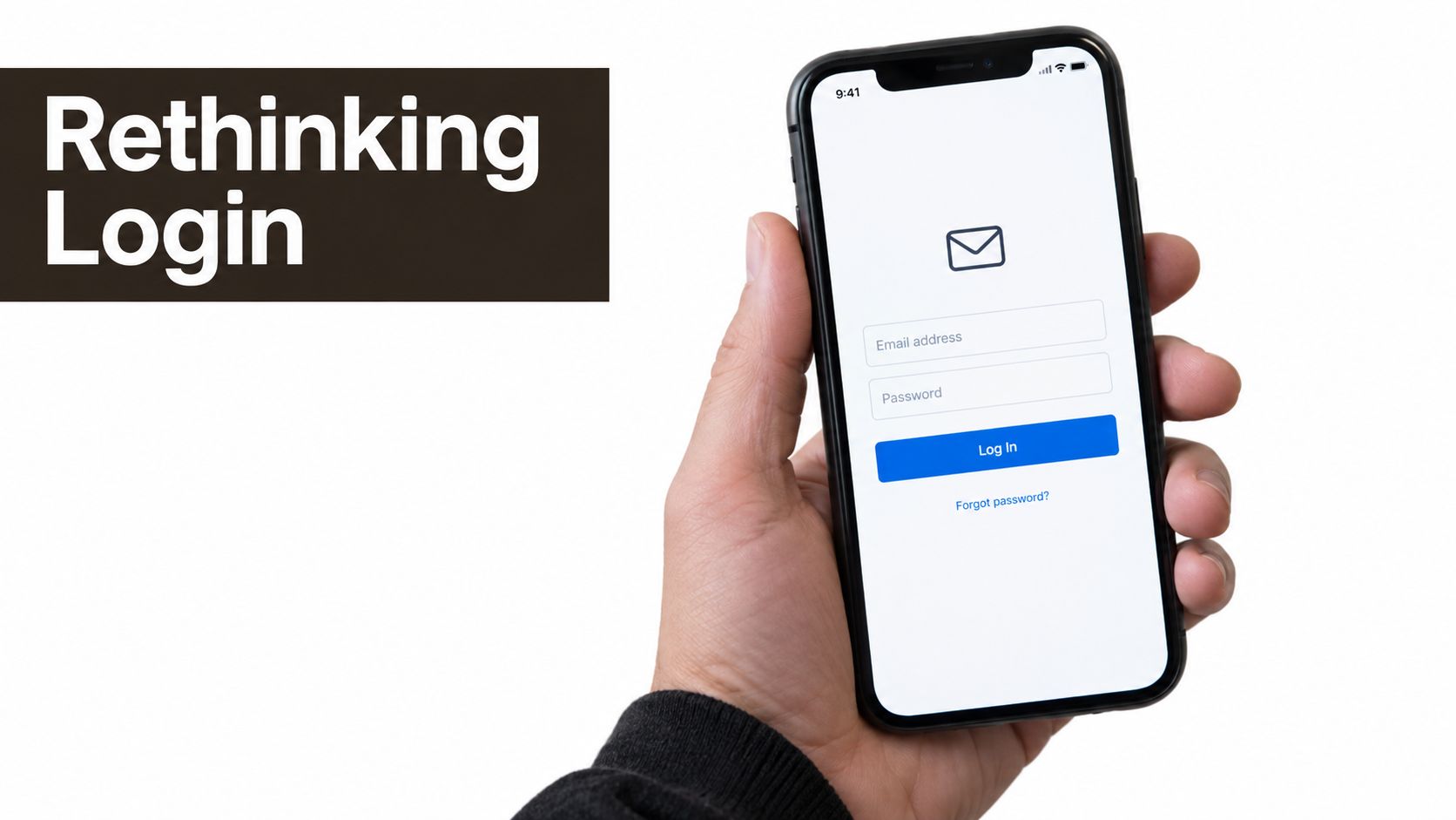 A hand holding a smartphone displaying a clean and modern user login interface for mobile applications.
Design for the failed attempt
The happy path is only one state. A production login screen also needs to explain an invalid credential, a timed-out request, an unavailable identity provider, an expired deep link, and a device that's offline. Each state should answer three questions: what happened, whether the user's data was preserved, and what action is available next.
For example, “Unable to sign in” is weak because it doesn't identify the problem or offer a useful recovery action. “We couldn't reach the server. Check your connection and try again” is more actionable for a network failure. An incorrect credential message should avoid exposing whether an account exists, while still offering password recovery or another sign-in method.
Practical rule: Treat every error state as a small decision screen, not as red text beneath a field.
Accessibility belongs in the same conversation. Labels, focus order, dynamic type, contrast, screen-reader announcements, and recovery behavior determine whether users can complete the flow independently. The mobile app login screen guidance from AppLighter is useful alongside broader advice on how to build trust with login UX, because trust comes from predictable feedback as much as from visual polish.
A strong login surface also respects context. Someone returning to an app may want a one-tap biometric prompt. Someone on a shared device may prefer a password. Someone using an enterprise account may need SSO. Put the most likely low-friction method first, but keep alternatives discoverable and recovery visible. The screen should feel fast when everything works and honest when it doesn't.
Building Accessible and Responsive Layouts
A login page can fail before authentication runs. On a small phone, a rotated device, split-screen view, resized browser, open keyboard, or enlarged text setting, fixed coordinates can hide the field or primary action. Start with a flexible container, use SafeAreaView or react-native-safe-area-context for insets, and place the form in a ScrollView so the focused control stays reachable.
A practical layout has five parts:
- Adaptive root: Use flexbox and sensible horizontal padding instead of fixed positions.
- Keyboard-aware content: Combine
KeyboardAvoidingViewwith a scrollable form, then test the configured keyboard behavior on each target platform. - Stable field order: Keep visual order, accessibility order, and keyboard order aligned.
- Flexible text: Let labels, helper text, and buttons grow with user-selected text sizes rather than clipping or overlapping.
- Reachable actions: Make the full visual button area tappable with
Pressable, not only the text node.
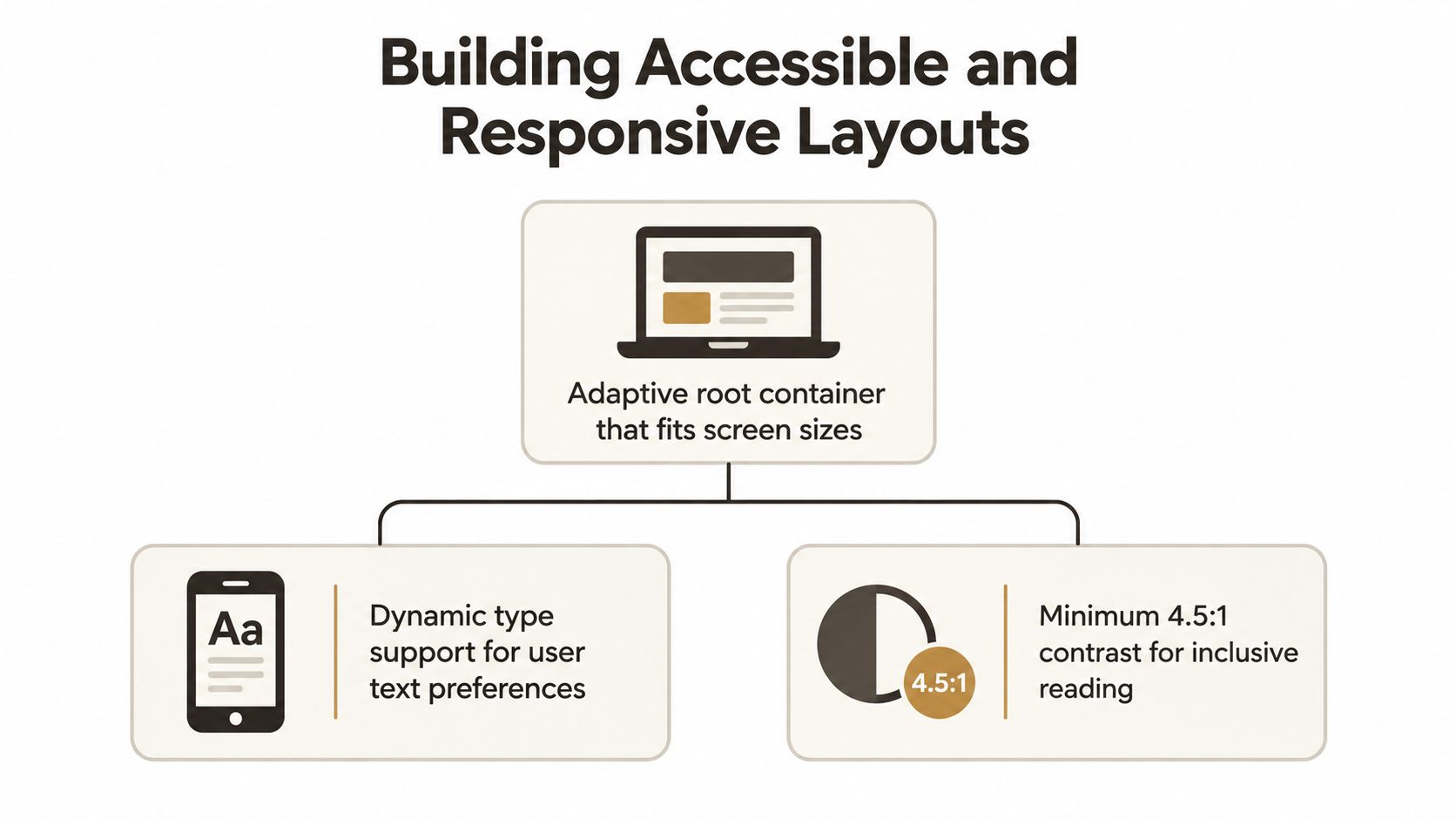 A diagram outlining accessibility and responsive layout principles for building user-friendly digital interfaces and mobile applications.
Build semantics into each control
A placeholder is not a label. It disappears after typing and forces users to remember what the field means. Pair every TextInput with a persistent Text label. Add accessibilityLabel when the visible relationship is unclear, and use accessibilityHint only when the action needs extra explanation.
Configure input behavior explicitly. Email fields should use keyboardType="email-address", autoCapitalize="none", autoCorrect={false}, and an email-related autoComplete value. Password fields should use secure text entry and provide a clearly labeled show or hide control. Styling alone does not communicate intent reliably to assistive technology or autofill services.
Make focus and errors predictable
Validation needs a deliberate focus policy. For a malformed email, keep the user near the field and announce the message through an accessible live region or an equivalent platform pattern. For rejected credentials, focus can move to a summary while preserving the entered email. Clearing both fields after every failure creates unnecessary typing and makes recovery slower.
Accessibility gaps in React Native login page design usually appear in these non-default states. The guidance on accessible labels, focus order, dynamic type, contrast, and error recovery reflects the implementation work involved: a control may look correct yet fail under a screen reader, expanded text, or keyboard obstruction.
Check contrast in light and dark themes, and never communicate an error with color alone. Pair color with text, give icons accessible labels, and expose state changes that assistive technology can announce. Test VoiceOver, TalkBack, keyboard navigation on web, enlarged text, reduced motion, rotated devices, and narrow viewports. Accessibility is part of the layout contract, not a finishing pass.
Integrating Modern Passwordless Authentication
A user opens your React Native login screen on a phone that already supports passkeys, but the interface offers only two empty fields. That extra typing is a product decision, not a technical limitation. In 2026, 75% of global consumers were aware of passkeys, and 48% of the top 100 websites offered them, according to Descope's summary of passwordless authentication trends. The same source reported that 45% of organizations had deployed passkeys in at least one application, while 27% planned to implement them within two years.
Those figures do not justify removing passwords from every app. They support designing the authentication layer for multiple methods from the start. A login entry point can place a passkey or biometric action first, offer Apple or Google sign-in where it fits the product, and retain email-password access for compatibility and recovery.
Choose the order based on context
Passkeys work well when a registered device credential is available and the platform can show a familiar biometric or device-access prompt. They reduce typing and resist phishing, yet first-time users may need context. Use a clear action label, explain the expected prompt, and keep an obvious alternative visible when the device lacks support or the credential cannot be found.
Social sign-in reduces form entry, but adds provider dependency, account-linking decisions, and a separate recovery path. Enterprise SSO may matter for a business product, while consumer providers need a clear hierarchy so the screen does not become a row of equally weighted buttons. Email and password still serve users who need broad compatibility or prefer not to use a platform credential. A practical comparison of user authentication methods can help map those choices to the product's users and recovery requirements.
Select libraries only after checking the mobile platforms and backend contract. expo-auth-session supports browser-based OAuth flows. react-native-app-auth fits native OAuth and OpenID Connect integrations when its native configuration suits the project. Passkeys also require server-side challenge handling, credential registration, assertion verification, and account recovery. A React Native screen cannot secure that system by itself.
Passwordless should remove effort, not remove choice.
Cross-platform consistency means consistent product language and state handling, not identical pixels. iOS and Android can show different system prompts, browser sessions, credential providers, and back-navigation behavior. Let those platform surfaces remain native, while your screen explains the current step and provides a dependable recovery route.
Research summarized by industry analysis of authentication methods reports login success rates around 93% for passkeys compared with 63% for other methods, while average login time drops from 31.2 seconds with MFA to 8.5 seconds with passkeys. Treat these figures as directional, not as a promise for every app. Track method availability, prompt cancellation, provider failure, recovery completion, and successful session creation separately. That instrumentation shows whether the new option reduces real input friction or merely adds another path to maintain.
Implementing Robust Form Validation and State
A login form needs an explicit state model. Boolean flags such as isLoading and hasError often become ambiguous once the app supports retries, offline mode, provider redirects, and session restoration. Model the meaningful states instead: idle, validating, submitting, offline, provider pending, authenticated, and failed.
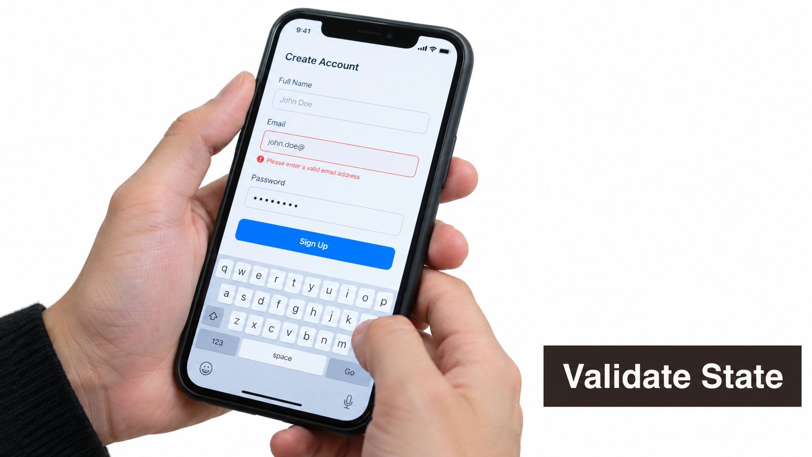 A person holding a smartphone displaying an account creation screen with an email validation error message.
Validate what the client can know without pretending it can verify the account. Check that the email has usable structure, trim accidental whitespace, and require a password value when that method is selected. Leave credential validity to the server. Client validation should prevent avoidable requests, not duplicate backend policy so aggressively that valid users get blocked.
Preserve context during failure
The form should distinguish field errors from request errors. A malformed email belongs beside the email field. A rejected sign-in belongs in a form-level message. A timeout should explain that the result is unknown and offer a retry, rather than claiming the credentials were wrong. If a provider callback fails, return the user to the login surface with the selected method and a clear next action.
A useful state transition preserves entered values while preventing duplicate submissions:
- Idle: Inputs are editable and the primary action is available.
- Validating: Local checks run and the first invalid field receives focus.
- Submitting: Disable only the actions that would create duplicate requests, while keeping recovery links available.
- Offline or timeout: Explain the connection problem and expose retry without discarding input.
- Provider failure: Identify the affected method and offer another route.
- Success: Store the authenticated session through the established auth boundary, then continue once.
External validation can help with signup and account recovery, where malformed or disposable addresses create downstream problems. A service such as BillionVerify's Email Validation API may fit that workflow, but don't turn an email lookup into a vague login gate or expose account existence through different messages.
Passkey research cited earlier reports around 93% login success for passkeys versus 63% for other methods, with average login time of 8.5 seconds compared with 31.2 seconds for MFA. Those results reinforce a practical rule: don't make the password form carry every use case. Instrument each path so you can see where users abandon, cancel a prompt, hit a provider error, or recover successfully.
For shared state, choose the smallest tool that keeps transitions understandable. React Context can handle a modest session boundary, while TanStack Query is useful for server-state concerns and a dedicated store can manage client-only auth UI state. This comparison of TanStack Query, Zustand, and Redux for React Native helps clarify where each responsibility belongs. Don't store secrets in the bundle or rely on client state as proof of authorization. The backend must remain authoritative.
Adding Polished Animations and Transitions
Motion should explain a state change. It shouldn't delay a sign-in action, obscure an error, or compete with the system biometric prompt. A restrained transition from editable form to submitting state can reassure users that the tap registered, while a short inline error transition can draw attention to the exact place that needs correction.
Use react-native-reanimated when animations need to remain smooth while JavaScript is busy, or the built-in Animated API for straightforward transitions with modest requirements. Keep animation state separate from authentication state. A request shouldn't depend on a completion callback from a decorative animation before it can resolve or fail.
Animate meaningfully
Good candidates include:
- Revealing or collapsing a password recovery panel.
- Replacing the submit label with a progress indicator.
- Moving focus emphasis to a field with an actionable error.
- Confirming successful session creation before navigation.
- Expanding a provider explanation when the user needs fallback guidance.
Avoid bouncing logos, long entrance sequences, and layout shifts that move the primary action while someone is trying to tap it. Respect reduced-motion preferences where the platform exposes them, and make sure the underlying state is communicated through text and accessibility announcements.
Measure on slower devices rather than assuming a simulator represents real use. Keep animated properties on the UI-friendly path when possible, avoid repeatedly creating animated objects during render, and clean up listeners when the screen unmounts. A login screen earns trust through immediate feedback, not visual spectacle.
Choosing the Right Architecture for Scale
A small app can start with a Context provider that exposes the current session, sign-in actions, sign-out, and restoration status. That approach is easy to inspect and often enough for a single authentication boundary. It becomes uncomfortable when screens start owning token refresh, provider redirects, account linking, biometric preferences, and error translation themselves.
A feature-based auth module creates a clearer boundary. Keep the login UI responsible for rendering and user intent. Keep credential calls, OAuth callbacks, passkey ceremonies, session persistence, and error mapping in services or hooks that can be tested independently. The navigation layer should react to an authenticated session rather than deciding whether a credential is valid.
| Approach | Works well when | Main trade-off |
|---|---|---|
| React Context | The app has a small session surface and limited auth methods | Complex transitions can spread across providers and screens |
| Zustand or another focused store | Auth UI and client state need lightweight shared actions | The team must define boundaries so server state doesn't become a global dumping ground |
| Redux | Many features need strict event history, middleware, and predictable transitions | More ceremony can slow a small product |
| TanStack Query plus a session boundary | The app separates server data from local authentication UI | It still needs a deliberate token and persistence design |
The choice should leave room for new methods. Okta's 2025 Secure Sign-in Trends Report found that phishing-resistant, passwordless authentication rose 63% in one year, from 8.6% to 14.0% of users. That shift, documented in Okta's report on secure sign-in trends, makes extensibility a practical concern. If your screen hardcodes one password mutation, adding passkeys or enterprise SSO later will force a rewrite.
AppLighter provides Expo and React Native starter templates with preconfigured authentication, navigation, state management, and routes such as sign-in, sign-up, and forgot-password flows. That can give a small team an initial auth structure to inspect and adapt, while the backend, security decisions, accessibility testing, and failure-state behavior still require deliberate implementation.
The scalable login screen is a thin interface over a well-defined authentication system.
Start by writing down the states and transitions before choosing a store. Test credential rejection, offline recovery, provider cancellation, expired sessions, large text, screen readers, and platform-specific redirects. If the architecture makes those cases explicit, visual changes remain cheap and authentication methods can evolve without turning the login screen into a fragile collection of conditionals.
AppLighter gives Expo and React Native teams a starter foundation with authentication screens, navigation, state management, and connected app structure, so you can spend less time wiring the login surface and more time testing resilient UX. Review the available templates and auth flows at AppLighter, then adapt the foundation to your product's accessibility, recovery, and passwordless requirements.