7 Best Web UI Systems for Expo Projects
Explore 7 best web UI systems for modern interfaces, responsive Expo projects, accessible components, and cross-platform design decisions.
 Rishav
The most popular React library isn't automatically the best web UI choice for an Expo project. A web dashboard can look excellent in isolation and still create duplicated tokens, incompatible interaction patterns, or a second accessibility workload beside the mobile app. The better decision starts with four practical questions: Does the team need one design language across mobile and web? How much styling control does it want? Are enterprise widgets required? Who'll maintain accessibility and component updates?
The seven systems below represent different delivery paths. AppLighter and Tamagui fit teams where Expo and shared mobile-web UI are central. MUI and Ant Design suit broad web application suites. Chakra UI prioritizes accessible theming and developer ergonomics, while Radix UI and shadcn/ui give teams more ownership over the final interface. Each recommendation is tied to a concrete implementation scenario, so you can choose based on delivery constraints rather than popularity.
Table of Contents
- 1. AppLighter
- 2. MUI
- 3. Chakra UI
- 4. Ant Design
- 5. Radix UI
- 6. shadcn/ui
- 7. Tamagui
- Top 7 Web UI Libraries Comparison
- Choose the System That Matches Your Delivery Model
1. AppLighter
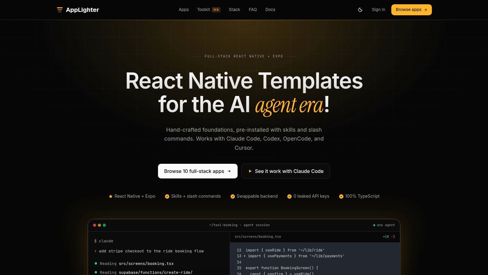
AppLighter is the strongest option when the web target is part of a broader Expo product, not a detached marketing site. It provides full-stack React Native and Expo templates for iOS, Android, and web, with authentication, navigation, state management, backend integration, and AI features already connected. That matters because the best web UI for an Expo team often starts with a coherent product foundation, not an isolated component package.
The templates combine designer-vetted screens, shared design tokens, light and dark themes, NativeWind styling, and Reanimated motion. The result is an opinionated starting point that can support a mobile app and a web-facing interface without forcing the team to invent the product architecture first. AppLighter also supports a web setup for React interfaces or admin portals, which makes it useful when the browser target needs more than a responsive version of a mobile screen.
Where AppLighter earns its premium position
The main advantage is speed with ownership. You get source code that your team can adapt, rather than a hosted builder that limits how the app evolves. The backend layer uses Vibecode DB with a Supabase adapter by default, while adapters for Drizzle and Neon support a different infrastructure direction. Hono and TypeScript provide an edge-ready API layer, and AI integrations support bring-your-own-key setups across providers and local models.
Security also belongs in the UI decision. Client bundles shouldn't contain sensitive provider keys, and AppLighter's architecture places secrets in edge functions while using reviewed row-level security policies at the data layer. Authentication flows are penetration-tested, API endpoints are rate-limited, and typed contracts create a clearer boundary between screens and services.
Practical rule: Choose a starter system that makes the safe path easier for the whole team, including the coding agent that will modify it later.
Agent readiness is a meaningful differentiator. Repositories include CLAUDE.md, AGENTS.md, .cursorrules, reusable skills, and commands such as /add-screen and /swap-backend. Those files give agents like Claude Code, Codex, OpenCode, and Cursor an architectural map instead of leaving them to guess where a new screen, data contract, or backend adapter belongs. Teams evaluating developer productivity patterns for structured app delivery will find this more durable than generating disconnected UI snippets.
The trade-off is clear. AppLighter is developer-oriented, so non-technical founders still need a capable developer or agency. AI keys, hosting, and infrastructure remain the buyer's responsibility. If your project is a web-only admin suite with complex tables, MUI or Ant Design may give you more specialized widgets immediately. If your goal is a polished, extensible Expo product with a web target, AppLighter is the most complete starting point on this list.
 AppLighter
2. MUI
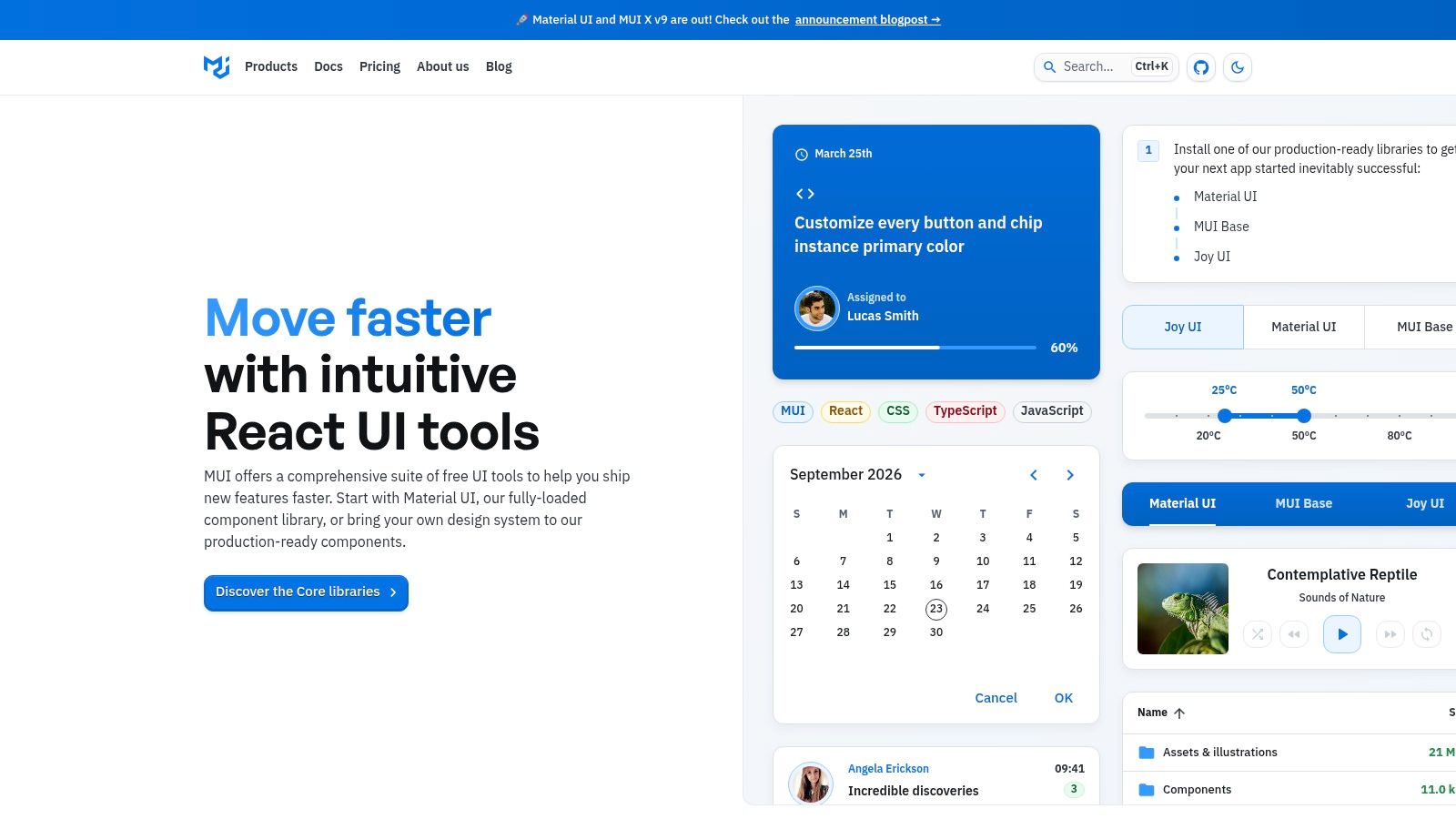
MUI is the practical choice for a web application that needs a mature component catalog and a clear path into enterprise features. Material UI supplies day-to-day React components, theming, and design-system guidance under an MIT license. MUI X extends that foundation with advanced data grids, charts, schedulers, and other commercial components.
For an Expo team, MUI works best when the web product is separate from the mobile interface. A company might share brand tokens, typography decisions, and product terminology across platforms while using React Native components on mobile and MUI components in a browser-based operations portal. That split is sensible when the web experience depends on dense tables or desktop-first workflows that don't map naturally to touch screens.
The enterprise trade-off
MUI's documentation and ecosystem reduce onboarding risk. Teams can hire developers familiar with the system, establish theme overrides, and build a repeatable component layer without designing every primitive themselves. The Material defaults are also useful during early product work because they provide a coherent visual language before a custom brand system is complete.
The cost appears when the product must look unlike Material Design. You can customize MUI extensively, but heavy customization requires disciplined theme work and careful review of generated styles. Advanced tables and other power components also move into the paid MUI X range, so the free core shouldn't be treated as the complete enterprise package.
MUI complements Expo when the browser is a full application surface, not when the team is trying to make one component implementation behave identically everywhere.
Use MUI for a web admin portal, analytics workspace, or internal tool attached to an Expo mobile product. Don't choose it solely because it has a large catalog if the primary requirement is one universal UI layer across iOS, Android, and web.
 MUI
MUI
3. Chakra UI
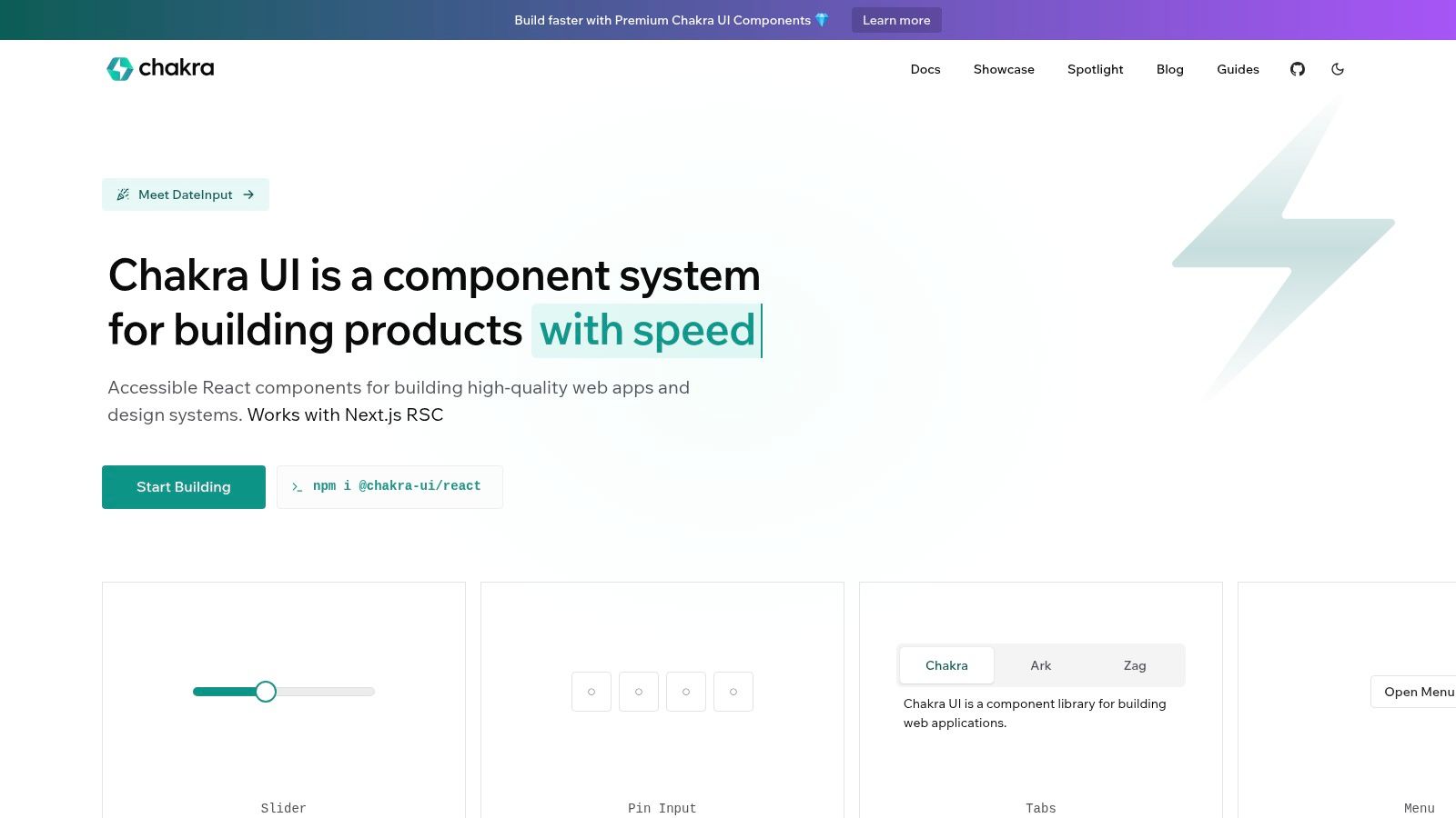
Chakra UI suits teams that want to move quickly without treating accessibility and theming as later cleanup. Its component APIs are designed for developer ergonomics, with sensible defaults and a token-based approach that makes spacing, colors, typography, and recipes easier to centralize. The system also includes Ark UI headless primitives and Zag's state-machine-driven interactions for teams that need more control than the styled components provide.
An Expo product team can use Chakra for a web companion, customer portal, or responsive account area while maintaining a separate React Native implementation on mobile. It won't give you the same universal component layer as Tamagui, but it can preserve the same product language through shared design tokens and naming conventions.
Accessibility and runtime considerations
Chakra's accessible defaults are valuable, but they don't remove the need for testing. A 2026 audit of 1 million homepages found detectable WCAG failures on 95.9% of pages, with an average of 56.1 errors per page, as reported in the State of Accessibility research. That evidence makes accessibility ownership a delivery responsibility, not a library checkbox.
Chakra's runtime styling model currently relies on Emotion, while its lower-runtime direction is still developing. That can be perfectly acceptable for many product dashboards, but teams focused on strict rendering budgets should measure their own application rather than assuming a styling architecture will be free.
Ark UI gives Chakra users a useful escape route. You can keep the interaction behavior and replace the visual layer when a component needs a product-specific treatment. The weaker fit is a data-heavy enterprise application that needs many specialized widgets out of the box. MUI X or Ant Design may reduce implementation work there.
 Chakra UI
4. Ant Design
Ant Design is built for teams that need to ship dense business interfaces, particularly admin systems with complex forms, tables, filters, permissions, and workflow states. Its visual language is opinionated, but that opinion comes with practical patterns for back-office software. ProComponents and Ant Design Pro add further structure for common administrative layouts.
That makes Ant Design a strong web complement to an Expo mobile app used by field staff, customers, or sales teams. The mobile app can focus on quick actions and touch-friendly flows, while the browser application handles bulk editing, reporting, account management, and operational review. Trying to force both surfaces into identical layouts would usually create a worse experience on at least one platform.
When density matters more than brand flexibility
Ant Design's forms and tables are the central reason to choose it. A team can assemble an internal tool quickly because the library already reflects enterprise workflows instead of requiring a custom pattern for every filter row or validation state. Design tokens and the current CSS-in-JS architecture provide customization points, but the system's defaults remain visible.
The limitation is brand ownership. If your product needs a highly distinctive visual identity, overrides can spread across component states, spacing rules, responsive behavior, and interaction details. The library can also bring more styling and component complexity than a headless approach, especially when the application uses only a small portion of its surface.
For dense operations software, consistency across forms and tables usually matters more than novelty.
Choose Ant Design when web users manage records, workflows, or operational data for long sessions. Avoid it for a lightweight consumer-facing web experience where a custom visual language and a close mobile-web relationship matter more than prebuilt enterprise patterns.
5. Radix UI
Radix UI is for teams that want accessible behavior without surrendering visual ownership. It provides unstyled React primitives such as dialogs, selects, comboboxes, and tooltips, then leaves the markup styling and design decisions to your system. That separation is particularly useful when the product needs a brand-specific interface that still handles focus management, keyboard interaction, composition, and other difficult states correctly.
Radix is web-first, so it isn't a universal Expo component library. Its best relationship with React Native is architectural rather than literal. A team can define shared tokens and product rules across mobile and web, then implement platform-specific components with Radix on the browser and React Native primitives on mobile.
Build the system, don't just install the package
The benefit is precise control. Radix components work with Tailwind, CSS-in-JS, or another styling approach, and their APIs provide escape hatches when the application needs direct DOM access or custom composition. This lets a design team create brand-perfect controls rather than negotiating with a pre-styled component's assumptions.
The cost is the work you now own. You must create states, tokens, visual regression coverage, responsive behavior, icons, and data-heavy components around the primitives. Radix won't give you a complete enterprise data grid or a finished application shell.
Use Radix when your team has design-system capability and expects to maintain the component layer for years. It's especially effective for a web portal that shares a product identity with an Expo app but has its own browser interaction model. Don't choose it for a fast prototype if nobody is available to finish and maintain the styling system.
6. shadcn/ui
shadcn/ui takes source ownership further than a conventional component package. Instead of hiding the implementation behind a dependency boundary, it adds editable components to your codebase, combining Tailwind CSS with Radix primitives. You can change the component directly, audit its behavior, and version the result alongside the product.
That model works well for a web dashboard attached to an Expo application when the team wants the browser UI to follow the same brand tokens but doesn't want a large, locked component abstraction. The registry approach makes it straightforward to add components and blocks, including private registry support for organizations that maintain internal patterns.
Source ownership has a maintenance bill
The appeal is obvious for product teams with strong front-end ownership. A designer and developer can adjust the markup, classes, variants, and behavior without waiting for a library to expose a prop. Radix provides the accessible base behaviors, while Tailwind makes the final visual rules visible in the repository. Teams learning how utility-first styling affects component ownership can use this Tailwind CSS explanation for web developers as a practical reference.
The compromise is that updates aren't automatic. Once components live in your repository, your team must compare upstream changes, merge improvements, and test every customized variant. Tailwind is also central to the intended workflow, so adopting shadcn/ui in a different styling stack introduces friction rather than removing it.
Choose shadcn/ui when long-term control matters more than turnkey convenience. It works particularly well for a web-only admin portal whose interface needs to evolve rapidly under one team's ownership. For a shared mobile-web UI, it requires a deliberate token and behavior strategy because the source components themselves aren't React Native components.
7. Tamagui
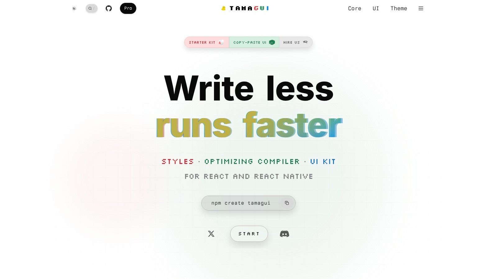
Tamagui fits teams building one product across Expo, React Native, and the web. It supplies shared tokens, themes, React Native and browser compatibility, and a compiler that can optimize styles at build time. Its SSR-friendly behavior also suits web targets that need server rendering instead of a client-only dashboard.
The practical advantage is a shared design vocabulary. Buttons, cards, sheets, and text styles can use the same tokens on mobile and in the browser, while platform-specific behavior remains available for touch, pointer, keyboard, and screen-size differences. For a broader comparison of cross-platform token strategies, see these React Native UI libraries. This approach can reduce visual drift between an Expo app and its web counterpart without forcing every interaction into one implementation.
Universal doesn't mean effortless
Tamagui requires more setup than a web-only library. Teams must understand its compiler, universal component patterns, responsive behavior, and the differences between React Native and browser semantics. Shared code is valuable only when the interaction remains appropriate on both platforms. A navigation pattern optimized for touch may need a separate web treatment, even when its tokens are shared.
The open-source core suits teams that want to own their foundation. Pro kits and starters can speed up scaffolding for teams prepared to use commercial assets. The decision depends on whether one UI layer justifies the learning curve and the additional rules around platform-specific behavior.
Expo adoption is also supported by a maturing React Native foundation. The 2025 React Native ecosystem survey reported 80% adoption of the new architecture, and 88% of respondents agreed or strongly agreed that React Native is moving in the right direction. For a Tamagui evaluation, those results make a universal layer a lower-risk choice than it was two years ago, especially for performance-sensitive Expo products with a serious web target.
Choose Tamagui when the team plans to build and maintain a shared design system across mobile and web. Choose AppLighter when production screens, backend wiring, and agent-ready conventions matter more than owning the UI foundation.
 Tamagui
Top 7 Web UI Libraries Comparison
| Title | Implementation Complexity 🔄 | Resource Requirements ⚡ | Expected Outcomes ⭐📊 | Ideal Use Cases 💡 | Key Advantages ⭐ |
|---|---|---|---|---|---|
| AppLighter | High 🔄 Full‑stack + agent tooling; developer‑oriented | Medium–High ⚡ Codebase, hosting, DB, BYOK AI keys | High ⭐ Production‑ready, secure, polished cross‑platform apps | Indie devs, startups, agencies building RN/Expo mobile apps | Designer‑vetted UI, agent‑ready workflows, security & swappable backend |
| MUI (Material UI + MUI X) | Medium 🔄 Plug‑and‑play components; theming effort for brand | Low ⚡ Frontend only; optional paid MUI X for enterprise widgets | High ⭐📊 Polished web UI and design‑system alignment | Web apps, dashboards, enterprise frontends | Mature ecosystem, excellent docs, advanced paid enterprise components |
| Chakra UI | Low–Medium 🔄 Ergonomic APIs; quick to adopt | Low ⚡ Frontend + theming; minimal infra | High ⭐ Accessible, consistent UIs quickly | Startups, Next.js apps, teams prioritizing accessibility | Accessibility‑first, developer ergonomics, MIT license |
| Ant Design (AntD) | Medium–High 🔄 Rich API surface; heavier customization for branding | Medium ⚡ Frontend; larger bundle for full feature set | High ⭐📊 Feature‑rich, enterprise/back‑office readiness | Data‑heavy internal tools, admin dashboards | Extensive components for forms/tables and enterprise patterns |
| Radix UI (Primitives) | Medium–High 🔄 Unstyled primitives; more design work required | Low–Medium ⚡ Needs styling system (Tailwind/CSS‑in‑JS) | High ⭐ Accessible, fully brandable components | Teams building custom design systems and accessible UIs | Unstyled, a11y‑compliant primitives with composition control |
| shadcn/ui | Medium 🔄 Source‑scaffolded components; Tailwind‑centric | Low–Medium ⚡ Next.js + Tailwind dev effort; maintain upstream merges | High ⭐ Highly customizable, owned UI codebase | Next.js/Tailwind projects that want editable components | Source‑based components, easy customization, built on Radix |
| Tamagui | High 🔄 Cross‑platform compiler & patterns; learning curve | Medium ⚡ Single UI layer for mobile+web; build/SSR tooling | High ⭐📊 Performant, unified RN + web UIs | Expo/React Native apps needing performant web parity | Compile‑time style optimizer, universal tokens, SSR friendly |
Choose the System That Matches Your Delivery Model
There isn't one universal best web UI system for Expo projects. The right choice depends on whether your browser target is a second presentation of the mobile product, a separate operational application, or a fully custom web experience with its own design-system team.
Choose AppLighter when you want to start with designer-vetted Expo screens, full-stack wiring, security-conscious defaults, and agent tooling that can extend a working product. It fits indie developers, startups, agencies, and product teams that want to ship iOS, Android, and web from an owned codebase. Choose Tamagui when shared mobile-web components and universal design tokens are the central architectural requirement, and your team is prepared to learn and maintain the compiler-oriented workflow.
Choose MUI or Ant Design when the web product needs a broad, mature application suite. MUI is the more flexible general-purpose option, with an upgrade path into MUI X for advanced enterprise widgets. Ant Design is especially effective for dense forms, tables, and back-office workflows, though both systems bring stronger visual opinions than a primitive-based approach.
Chakra UI is a good fit when accessible defaults, straightforward theming, and developer experience lead the decision. Radix UI or shadcn/ui make more sense when design ownership outweighs convenience. Radix gives you behavior primitives, while shadcn/ui gives you editable source components. Neither removes the responsibility to test keyboard navigation, focus states, touch targets, reduced motion, contrast, and screen-reader flows.
AI agents add another reason to prioritize structure over visual novelty. Emerging coverage of web design trends around calm interfaces, multimodal interaction, and machine-readable experiences points toward interfaces that must serve people and agents. Semantic HTML, predictable labels, explicit state, and task-oriented flows will age better than effects that make the screen harder to parse.
Before standardizing, take five steps:
- Define shared tokens: Align color, type, spacing, elevation, motion, and state names across Expo and web.
- Prototype one responsive screen: Build the same realistic flow on mobile and browser, not just a component gallery.
- Test keyboard and touch interaction: Verify focus order, hit areas, gestures, loading states, and error recovery.
- Review maintenance ownership: Confirm who updates dependencies, merges source changes, audits accessibility, and manages security.
- Standardize after evidence: Expand the component set only after the prototype proves the system fits your delivery model.
If your interface includes imagery, also establish a consistent workflow for upscaling graphics for web developers, especially when the same visual assets must remain sharp across mobile and browser layouts.
AppLighter gives Expo teams a production-oriented starting point with designer-vetted screens, web support, connected authentication and backend layers, and agent-ready tooling for extending the UI safely. If you want to compare a shared mobile-web foundation with web-only component systems, visit AppLighter and choose a template that matches the product you're building.