How to Create a Wireframe for a Website: how to create a wireframe for a website
how to create a wireframe for a website: Learn practical steps for user flows, layout decisions, and prototyping to boost site usability and conversions.
 Rishav
Before you can turn a great idea into a real, working website, you have to get it out of your head and onto a screen. The first step is creating a wireframe—a simple visual guide that maps out how someone will actually use your product. Think of it as a blueprint. Using basic shapes and outlines, you'll define the layout and core functions for each screen, focusing entirely on structure over aesthetics. This is a non-negotiable first step for anyone serious about building an MVP efficiently.
Why Wireframing Is Your Most Important First Step
 Two designers discuss wireframes on a laptop and paper, emphasizing a 'Wireframe First' approach.
Before a single line of code gets written, there's a strategic move that separates successful projects from the ones that flounder. It’s not just a design formality; it’s your best defense against wasting hundreds of development hours and avoiding painful, expensive redesigns later.
Wireframing is the bedrock of product development. The market for online wireframe tools is set to hit $2.5 billion by 2025, which tells you everything you need to know about its importance. This isn't just for big corporations; it's how smart founders and indie developers—especially those using tools like AppLighter's premium starter-kit—are able to build and launch MVPs so quickly. For a deeper dive into these trends, check out the analysis from Archive Market Research.
Aligning Your Team From Day One
A wireframe is the single best way to get everyone on the same page. It’s a common language that developers, designers, product managers, and even investors can understand. This simple visual blueprint cuts through the noise and makes sure the idea in your head is what the team actually builds.
Getting this early alignment pays off in huge ways:
- It clarifies the project scope. A wireframe forces you to make tough decisions about what features are truly essential for your MVP and what can be shelved for later.
- It makes feedback easy. It’s much easier for people to give useful feedback on a simple sketch than on a polished design or a buggy prototype.
- It cuts down on wasted effort. Finding a major structural flaw in a wireframe costs next to nothing to fix. Finding that same flaw after the app is coded can set you back weeks.
A wireframe isn't just a sketch. It's a strategic document that validates your product's core logic. It answers the most important question—"Does this user journey actually make sense?"—long before you start arguing about button colors.
Low Fidelity vs High Fidelity Wireframes
Wireframes come in two main flavors: low-fidelity (lo-fi) and high-fidelity (hi-fi). Knowing which one to use at what stage is key. Lo-fi is all about quick ideas and structure, while hi-fi starts to feel more like the final product.
| Characteristic | Low-Fidelity (Lo-Fi) | High-Fidelity (Hi-Fi) |
|---|---|---|
| Visual Detail | Basic shapes, placeholders, and grayscale. No real content. | Detailed UI elements, real text, branding, and some color. |
| Purpose | To map user flows, test core concepts, and define structure. | To refine UI, test interactions, and prepare for development. |
| Tools | Pen and paper, whiteboards, or simple tools like Balsamiq. | Digital tools like Figma or Sketch. |
| Speed & Effort | Very fast to create and change. Low effort. | Slower to create. Requires more detail and precision. |
| When to Use | Early-stage brainstorming, initial concept validation. | Mid-to-late design phase, user testing, and developer handoff. |
Ultimately, most projects start with lo-fi sketches to get the foundation right and then evolve into hi-fi wireframes as the concept solidifies.
Focusing On Functionality, Not Aesthetics
The whole point of wireframing is to map out the structure and flow of your website or app. By deliberately leaving out colors, fonts, and images, you force everyone to focus on what really matters: usability and function.
This intentional simplicity helps you find answers to the tough questions early on:
- Where does the main call-to-action need to go to be effective?
- Is the navigation intuitive enough for someone using this for the first time?
- Does the layout guide the user toward their goal, or does it get in the way?
By nailing down these fundamental decisions first, you build a rock-solid foundation. The visual design and coding phases become infinitely smoother because all the structural thinking has already been done and agreed upon. This "structure-first" mindset is how you build products that are not only nice to look at but are also genuinely useful.
Mapping the User Journey Before You Draw Anything
Every great wireframe begins with empathy, not pixels. Before you even dream of dragging a box onto a canvas, you have to get inside your user's head. What are they trying to do? What's getting in their way?
Skipping this foundational step is like building a house without knowing who will live there. Sure, it might look okay from the outside, but it will be fundamentally unlivable. The first real move is to map out the user's journey, turning your big-picture goals into a logical sequence of screens. This ensures your wireframe is built to solve actual problems, not just to show off a list of features.
Start with a Quick User Persona
You don't need a ten-page dossier on your ideal customer. A simple persona is just a quick, fictional sketch that helps you see your product from a real person's perspective. It's a gut check to keep your own biases out of the design.
Just give them a name, a role, and a clear goal. For instance, if you're building a project management app with a tool like AppLighter, your persona could be:
- Name: "Alex, the Freelance Designer"
- Goal: Alex just needs a dead-simple way to track hours and send invoices. No fluff, no enterprise features.
- Pain Point: Every tool out there is either way too expensive or bloated with features he'll never touch, making them a nightmare to use.
Boom. This simple profile instantly becomes your North Star. When you're stuck on what to put on the dashboard, you just ask, "What does Alex need to see right away to get his work done?"
Nail Down the Primary User Flow
With Alex's needs in mind, it's time to map out the user flow. This is the literal path someone takes to accomplish a task in your app. Think of it as the A-to-B-to-C sequence that makes their goal a reality.
It’s like giving a friend directions. You don't just list random street names; you provide a step-by-step route from where they are to where they need to go. A user flow does exactly that for your app's navigation.
A user flow isn’t a list of features. It's a story about how someone accomplishes a task. By defining this story first, you ensure that every screen you wireframe has a clear purpose and logically connects to the next.
Let's walk through a classic user flow: sharing a photo on a social media app.
- Entry Point: The user opens the app to their home feed.
- Action: They tap the "Create Post" (+) icon in the main navigation.
- Step 1 Screen (Photo Selection): The app accesses the phone's camera roll. The user picks a photo.
- Step 2 Screen (Editing): An editing screen appears. They can add a filter or crop the image before hitting "Next."
- Step 3 Screen (Finalize Post): Now, they can write a caption, throw in some hashtags, and tag a location or a few friends.
- Confirmation: They tap "Share." The app publishes the post and brings them back to the home feed, where their new content sits right at the top.
This six-step flow is no longer an abstract idea; it's a concrete checklist for the screens you need to design. You're not just guessing anymore. You're building a visual blueprint for a journey you’ve already mapped out. This is the secret to turning a confusing interface into one that feels completely intuitive.
From Napkin Sketch to Digital Blueprint
You've mapped out the user flows, so you know the story of how people will move through your site. Now it’s time to give that story a physical form. We're moving from abstract ideas to a real, tangible structure—the first skeleton of your website.
And this whole process starts with the most powerful tool in your arsenal: a simple pen and paper. Seriously. Before you even think about firing up a design app, the humble napkin sketch is your best friend for getting ideas out of your head and onto the page.
The Surprising Power of Paper Sketching
Starting on paper is intentionally limiting, and that's precisely its strength. It stops you from getting sucked into the vortex of pixel-perfect alignment, font choices, or which shade of grey looks best. The only goal here is pure, fast, uninhibited exploration.
Sketching by hand gives you permission to be messy. It’s liberating. You can crank out five different versions of a homepage in ten minutes, a task that would take ages in a digital tool. This low-stakes approach is all about creative freedom, helping you quickly weed out the weaker concepts and zero in on a promising structure without any real time investment.
Let's say you're wireframing a user dashboard. On paper, you could quickly try:
- A classic layout with a prominent top navigation bar.
- A version with a collapsible sidebar menu for a cleaner look.
- A totally different approach using a card-based system for key info.
Each sketch is a quick-and-dirty hypothesis. It’s all about asking "what if?" without any consequences. This is hands-down the most efficient way to burn through bad ideas and land on a solid foundation before you ever touch a mouse.
Transitioning to a Digital Wireframe
Once you’ve got a couple of paper sketches that feel right, it’s time to move into a digital space. This is where tools like Figma or Balsamiq come in. You’re not trying to perfectly replicate your drawing; you’re formalizing its structure and hierarchy with clean, basic digital elements.
This is the logical next step. You started by understanding the user (persona), then you mapped their path (flow), and now you're building the layout (wireframe).
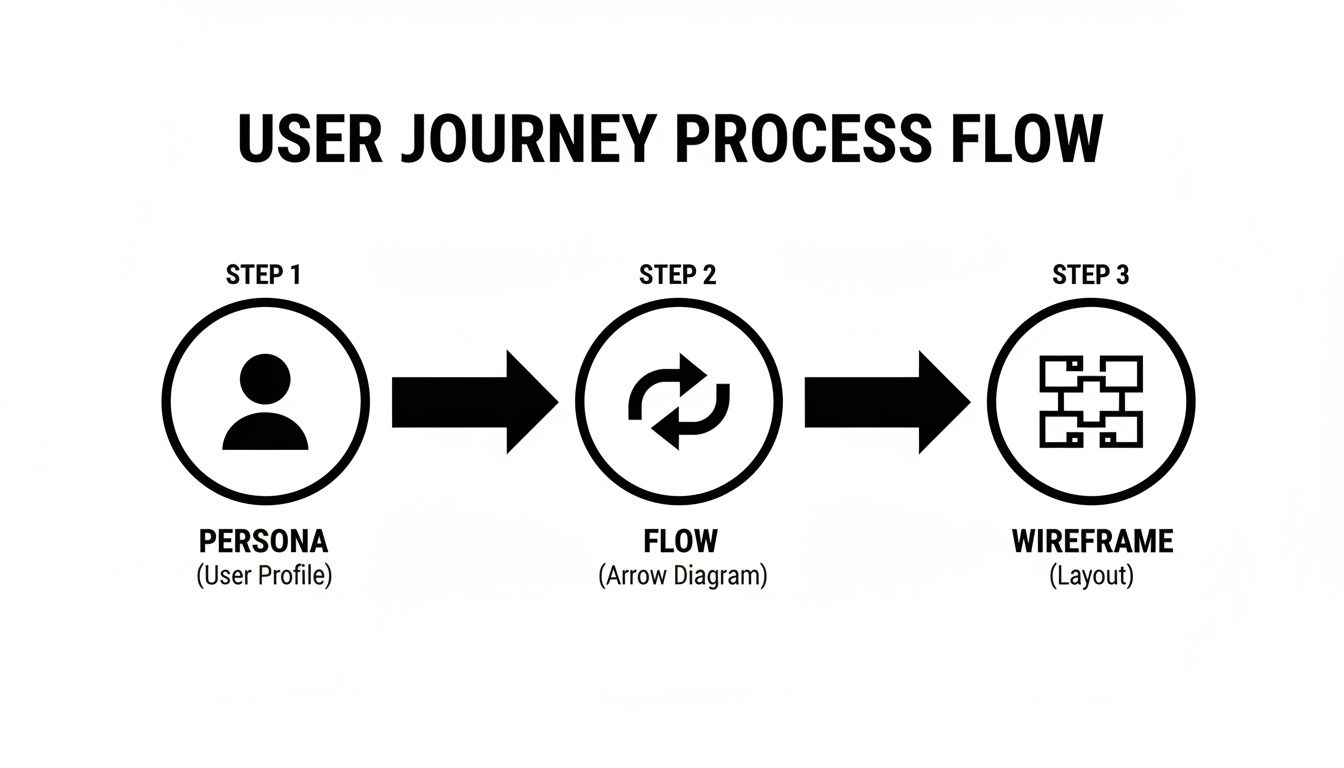 A user journey process flow diagram illustrating persona, flow, and wireframe creation.
Each stage informs the next, making sure your final wireframe is built on a solid foundation of user needs and a logical journey, not just a designer's whim.
Inside your tool, you’ll use basic shapes to block out the main UI components. Forget color, forget fonts, forget flair. Everything should be grayscale. Your focus needs to be laser-sharp on just three things:
- Structure: Where do the big pieces go?
- Hierarchy: What's the most important thing on the page? How do we show that?
- Functionality: What does this button or that link actually do?
Think of a low-fidelity digital wireframe as an architectural blueprint. It shows you where the walls, doors, and windows are, but it couldn't care less about the paint color or furniture. Its only job is to confirm that the layout makes sense.
Blocking Out Key UI Elements
As you build, you'll rely on a simple visual language to represent different types of content. This shorthand keeps everyone focused on the structure, not the decoration.
- Large rectangles are great for main content areas or hero banners.
- Smaller boxes with an 'X' through them are the universal sign for an image placeholder.
- Thin, long rectangles work perfectly for text inputs and form fields.
- Simple, labeled boxes become your buttons and Calls-to-Action (CTAs).
- Lines of dummy text (yes, 'lorem ipsum' is totally fine here) represent paragraphs.
New tools are making this even faster. In fact, over 70% of designers report that AI is helping accelerate their prototyping and wireframing work. While technology helps, the fundamentals don't change: start with the user, define the journey, and then block out your pages in grayscale. If you're curious about how AI is impacting the field, the latest web design statistics at NewMedia.com have some great insights.
Wireframing for Component-Based Systems
If you're building with a system like AppLighter that relies on pre-built components, you can make your wireframing process incredibly efficient.
Instead of just drawing generic boxes, you can create simple wireframe elements that directly map to the components in your library. For instance, rather than a grey box labeled "button," you can create a simple component in Figma called "Primary Button" that mirrors the dimensions of the actual coded component.
This approach is a game-changer. Your wireframe is no longer just a loose guide; it becomes a direct, one-to-one blueprint for the development team. When it's time to build, there’s zero guesswork. The developer knows exactly which component to grab, which dramatically cuts down the time it takes to get from design to a live product. You're building a bridge between layout and code, making the whole workflow faster and way more predictable.
Designing for Every Screen with Responsive Wireframing
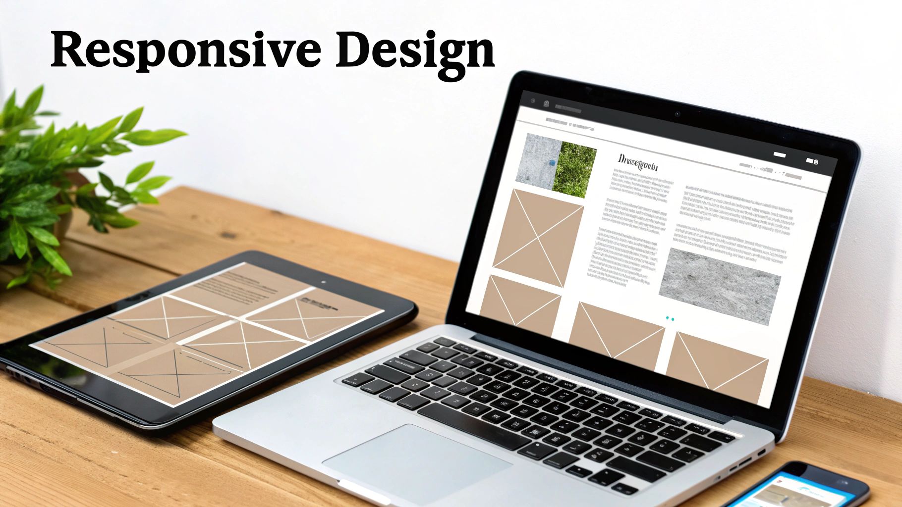 Laptop, tablet, and smartphone displaying a website with adaptable layouts on a wooden desk.
Let's be honest: a static desktop wireframe just doesn't cut it anymore. It’s a relic. Today, people will find your site on everything from a tiny phone to a massive monitor, and your design has to work beautifully on all of them. If you’re only thinking about one screen size, you’re setting yourself up for failure before you even start.
This is exactly why responsive wireframing is a non-negotiable skill. It’s all about creating a layout that can fluidly adapt to different screen sizes, giving every user a great experience. It forces you to think in terms of flexible grids and content hierarchy, not just fixed boxes on a page.
Embrace the Mobile-First Mindset
The best way I've found to tackle responsive design is by going mobile-first. Start your wireframing process on the smallest, most constrained screen—the phone. Seriously. It forces you to be ruthless about what really matters.
Why does this work so well? It's infinitely easier to add elements as you get more screen space than it is to cram a cluttered desktop design onto a tiny screen. Designing for desktop first often leads to a mobile version where you’re just hiding things or squishing them together awkwardly. Starting small makes sure the core user journey is solid, no matter the device.
The mobile-first approach isn't just a trendy technique; it's a strategic filter. It makes you prioritize like a seasoned pro, ensuring only the most critical content and actions define the core experience. Everything else becomes a thoughtful enhancement for larger screens, not a cluttered afterthought.
Planning for Adaptive Layouts
As you move from a mobile wireframe to a tablet and desktop version, you need to show exactly how the layout will adapt. This isn't about making three totally separate designs. It's about setting the rules for how elements will reflow, rearrange, and rescale.
Think about a standard e-commerce product page. Your responsive wireframes should clearly map out these kinds of transformations:
- Column Structure: What starts as a simple single column on mobile could expand to a two-column grid on a tablet (image left, details right), and maybe even three columns on a desktop to bring in related products.
- Navigation: That compact "hamburger" menu on your phone should transform into a fully visible, horizontal navigation bar on a desktop.
- Content Priority: On mobile, that "Add to Cart" button needs to be front and center. On a desktop, you have more room to showcase things like customer reviews or detailed specs higher up.
Wireframing Key Breakpoints
You don’t need to design for every single pixel width out there. That would be insane. Instead, focus your energy on the key breakpoints—the specific widths where your layout needs to make a significant change.
While the exact numbers can vary based on your project, a solid starting point is to wireframe three main views:
- Mobile (e.g., 375px wide): This is your foundation. It defines the core content hierarchy and the single-column flow. Every single element here has to earn its place.
- Tablet (e.g., 768px wide): Now we're talking. Here, you can introduce more complex grids. Elements that were stacked vertically on mobile can now sit side-by-side. This is often where you’ll see sidebars or multi-column layouts make their first appearance.
- Desktop (e.g., 1280px wide): This is the full canvas. It's where you have the luxury of adding secondary information, expansive menus, and more detailed interactive elements without cluttering the core experience you nailed down on mobile.
By creating wireframes for these three breakpoints, you’re giving developers a crystal-clear blueprint. It shows them precisely how components should behave as the screen size changes—which is absolutely vital when working with modern app builders like AppLighter. This direct mapping from wireframe to code is what turns a good plan into a great, truly adaptive application.
From Static Mockups to a Live Preview
A static wireframe is a snapshot. It shows you the what—the layout, the buttons, the content blocks. But to understand the how, you need to make it move. This is where you transform your collection of screens into a clickable prototype, giving you a real feel for how the app will actually work.
This isn't just a fancy extra step; it's a critical reality check. By linking your wireframes together, you create a basic, interactive simulation that puts your design to the test. It's your first chance to catch a clunky navigation flow or a confusing user journey before a single line of code gets written.
Imagine testing your user signup flow. You can literally click the "Sign Up" button, land on the registration screen, fill it out, and see the confirmation page. Walking through this process yourself often uncovers glaring issues you’d never spot on a static diagram. Fixing them now is easy and cheap. Fixing them later is a headache.
Bringing Your User Flows to Life
Thankfully, modern design tools like Figma make this incredibly straightforward. You essentially play connect-the-dots. You select an element, like a button on your home screen, and drag a little connector (often called a "noodle") to the screen it should lead to. You’re literally telling the story of how a user moves through your app.
When you're starting out, don't get bogged down trying to make every single element clickable. That's a waste of time. Instead, focus on the "happy paths" for your most important user flows.
- First-time Use: Can someone sign up and log in without getting lost?
- The Main Thing: Can a user actually perform the app's core function, like booking an appointment or adding an item to their cart?
- Getting Around: Does the main navigation make sense? Is it easy to jump between key sections?
By keeping the prototype focused on these critical paths, you ensure the feedback you gather is on what truly matters. It's a fundamental part of creating a wireframe for a website or app that gets a green light from stakeholders and users.
A clickable prototype changes the entire conversation. You stop asking, "What do you think of this design?" and start asking, "Were you able to complete this task?" That shift is how you get feedback that actually helps.
Leaving No Room for Guesswork with Annotations
Once your interactive prototype feels right, it's time to prepare it for the development team. A prototype shows the flow, but it doesn't explain the rules. That’s what annotations are for. These are just small, clear notes added directly to your wireframes to explain any logic or behavior that isn't visually obvious.
Think of it as leaving a clear set of instructions for the builders. Your goal is to eliminate any ambiguity so developers don't have to guess what you meant. Clear annotations are the bridge between your design and their code.
So, what kind of details should you be annotating?
- Component States: Show what a button looks like when you
hoverover it, when it'spressed, or when it'sdisabled. - Conditional Rules: Explain any "if this, then that" logic. For instance, "If the user isn't logged in, this button reads 'Sign Up'. If they are, it reads 'My Profile'."
- Error Handling: What happens when things go wrong? Show the exact error message for an invalid email or a password that's too short.
- Micro-interactions: Briefly describe simple animations. "The side menu should slide in from the left," or "This modal window should fade in."
Packaging It All Up for a Smooth Handoff
The final step is handing everything over to your developers. Just dropping a link to a Figma file into a chat with a "here you go" message is a recipe for frustration. A professional handoff is a neatly organized package that gives the dev team everything they need.
Your handoff package should be the single source of truth and include these key items:
- The Interactive Prototype: A link so developers can click through the experience themselves.
- Annotated Wireframes: The static screens with all your detailed notes right there on the design.
- A User Flow Diagram: The high-level map that shows how all the screens connect. This gives them the big-picture context.
- Critical Notes: A document covering anything else, like unique icon requirements, data formatting rules, or third-party API information.
If you’re working with a component-based platform like AppLighter, this process becomes even tighter. Your annotations can directly reference specific, pre-built components, making the translation from your design to the final code almost seamless. That kind of clarity is what gets projects built faster and more accurately.
Your Top Wireframing Questions, Answered
As you start wireframing, questions are bound to pop up. It’s a process that sits right at the intersection of big-picture strategy and nuts-and-bolts design, so it's completely normal to feel a bit stuck at times. Let's break down some of the most common hurdles that developers and product teams run into.
Getting a handle on the core concepts, picking the right tools for your situation, and learning how to get feedback that actually helps are all part of building a solid blueprint for your project.
Wireframe vs. Mockup vs. Prototype: What’s the Real Difference?
This is, without a doubt, the question I hear most often. And for good reason—getting these terms straight is crucial. When everyone on the team uses the same language, the whole design process runs smoother. Each of these represents a distinct step in the journey from idea to finished product, with each layer adding more detail and interactivity.
I find it helps to think of it like building a house:
- A wireframe is the architect's blueprint. It’s a low-fidelity, black-and-white sketch that shows you the layout—where the rooms, doors, and windows go. It’s all about structure, function, and user flow. Nothing more.
- A mockup is like the interior designer’s render. It’s a static but high-fidelity visual that brings in the color palette, typography, and actual imagery. This shows what the final product will look like, but you can't click on anything.
- A prototype is the interactive model home you can walk through. It's a clickable, high-fidelity simulation of the final product, built from your wireframes or mockups. The whole point is to test how the product works by letting users navigate through the experience.
You always start with the wireframe. Nail the structure first, then move on to making it look pretty.
What Are the Best Tools for a Solo Developer or Small Startup?
When you're a solo dev or part of a lean startup, every minute and every dollar counts. You can't afford to waste time on tools with a brutal learning curve or a price tag that makes you wince. The great news is that some of the most powerful tools out there are also incredibly accessible.
Here are a few I consistently recommend to teams that need to stay agile:
- Figma is the king of the hill for a reason. Its free plan is shockingly powerful, giving you everything you need for wireframing, high-fidelity design, and prototyping. The real-time collaboration is a game-changer, even if you’re just sharing a design with a single co-founder or client.
- Balsamiq is my go-to for lightning-fast, low-fidelity wireframes. It has a unique, hand-drawn look that’s entirely intentional. This keeps everyone focused on structure and flow, stopping stakeholders from getting hung up on colors and fonts way too early.
- Whimsical shines in that messy, early ideation phase. It's more than just a wireframing tool; it’s a digital whiteboard that combines flowcharts, mind maps, and wireframes on one canvas. It's perfect for mapping out a user journey and then immediately sketching the screens for it.
How Much Detail Should My First Wireframe Have?
Less is always more, especially at the beginning. Your first low-fidelity wireframe should be almost painfully simple. The only goal here is to validate the core layout and user flow. That’s it. One of the most common rookie mistakes is getting bogged down in tiny details, which just kills your momentum.
At this stage, focus only on these things:
- The basic structure, using simple gray boxes and placeholders.
- The content hierarchy, showing what information is most important.
- The primary user actions, like buttons and key navigation links.
Stick to grayscale. Seriously. Don't even think about colors, specific fonts, or real images. This deliberate simplicity forces the conversation to be about function and usability—which is exactly where it needs to be.
How Do I Get Feedback That’s Actually Useful?
Getting good feedback is an art form. If you just send someone a static image and ask, "So, what do you think?" you’re going to get vague, unhelpful opinions. To get feedback that truly strengthens your design, you have to be more deliberate.
First, take a few minutes to link your wireframe screens together into a basic clickable prototype using a tool like Figma. This lets people actually experience the flow you’ve designed. Then, instead of asking what they like, ask them to complete a specific task.
Try framing your questions like this:
- "Can you show me how you would add a new item to your cart?"
- "Walk me through how you'd go about resetting your password."
- "Does this flow for finding our contact information make sense to you?"
By watching what they do and listening to them think out loud, you'll uncover the real friction points. This method gives you actionable insights, not just subjective preferences, which is precisely what you need to build something people will love to use.
Ready to build your app faster than ever? AppLighter is the premium Expo (React Native) starter-kit that gives you a production-ready foundation with authentication, navigation, and state management already wired up. Skip the boilerplate and start building your core features today at https://www.applighter.com.
Related Articles

A Practical Guide to AI User Interface Design
Discover the core principles of AI user interface design. This guide for developers covers key models, ethical practices, and real-world UI/UX strategies.

Explore charts react native: Build Interactive Charts in Mobile Apps
Practical guide to charts react native: choose libraries, connect data with Supabase, and optimize performance for Expo apps.

A Practical Guide to UI Design for Mobile App Development
Master UI design for mobile app development with this guide. Learn real-world strategies for user research, wireframing, visual design, and developer handoffs.